Skip to content

Tunnel Rat

A native iOS app for navigating New York's Subways, built during my post-Figma hiatus.
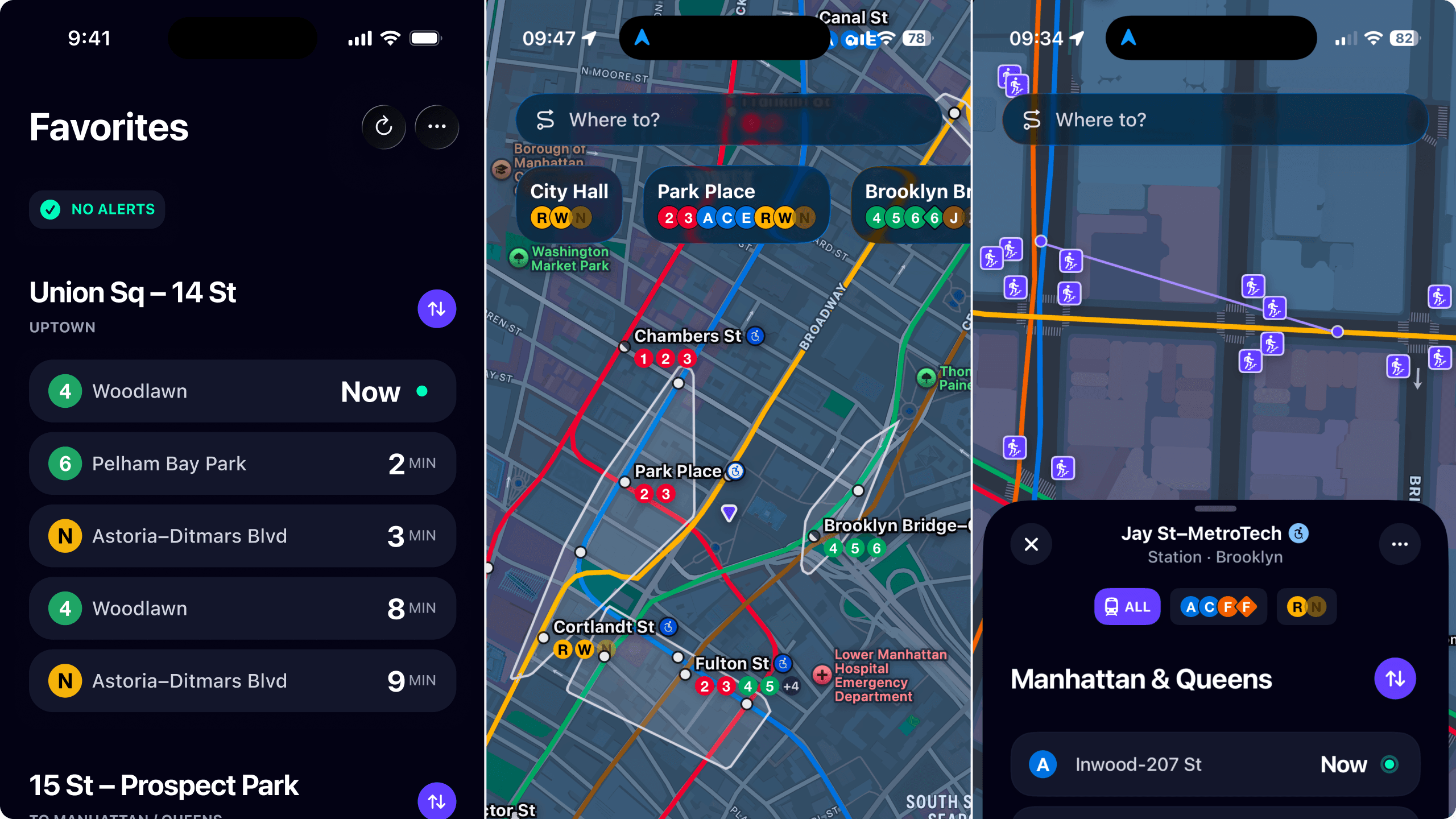
Three Tunnel Rat screens side by side: a Favorites list of live arrivals for Union Sq–14 St, the subway map with station labels and line bullets, and a station sheet for Jay St–MetroTech showing Manhattan & Queens departures

Context

  • tktk studio
  • Solo Maker
  • April – July '26

Overview

Problem

Most transit apps try to cover every mode of transit across every city, but sacrifice accuracy and specificity to do so. I had yet to find an app that simply and elegantly solved for NYC's subway specifically.

Approach

Prioritize how the day-to-day, commuting New Yorker uses and thinks about the subway: the stops they use every day and the lines they want to keep tabs on, all for free, without ads, and entirely private.

Ownership

I designed, built, marketed, and shipped the entire app, end to end.

Constraints

  • Entirely reliant on MTA and public city/state data and realtime infrastructure.
  • Need to minimize ongoing maintenance cost, given the app would be entirely free.

Decisions

1. Non-negotiables

I knew I wanted the app to stay true to a few principles, but needed to assess how feasible each would. Fortunately, my original set held true after that assessment:

  • Free. No payment, no ads, no freemium bits. Everyone gets all of the value of this thing, period.
  • Accessible. From actual features to the build itself, this app will be usable by anyone, of any ability or need.
  • Private. Essentially nothing will leave your device, and the app won't require any personal information.

2. Platform

As a solo designer and developer, I knew I'd need to focus on a single platform if I actually wanted to ship this thing. After some deep-diving into technical tradeoffs and demographic assessment, I landed on iOS as the starting point.

While this inherently limits use to those with iPhones, iOS supports the lion's share of users who use navigation apps in NYC, and it enables future access to the extended Apple universe: iPad, mac, watch, etc.

3. Scope

Grounded in the reality that I can't possible compete with the likes of Apple Maps or Google Maps, I defined a feature scope that felt both achievable and genuinely useful for subway riders.

In practice, that meant omitting bus routes from the MVP. Between the size and complexity of the dataset, and the low-ish percentage of riders who use mixed transit, it felt like the right call.

Results

Installs

  • ~80 installs in the first week.
  • Nearing 200 total, driven by LinkedIn, X, and word of mouth.

Growth

  • Growing ~14% week over week.
  • Largely organic, with a $3/day app store ad budget.

Performance

  • 939ms cold launch time
  • 99.8% crash-free session rate
  • 100% 30d data pipeline uptime

Learnings

1. Design the system, not just the prompt.

Rather than writing one big prompt and hoping for a stable answer, I found that building structure around the model—and narrowing its job to the part it's actually good at—was what made the output reliable. The LLM reads messy MTA prose and rewrites it for riders. Every classification it makes is constrained to a fixed set of options, anchored to MTA's own category, and ultimately backstopped by (inherently deterministic) code.

2. Audit the work, then audit the audit.

Before shipping, I ran a series of audits across the codebase—performance, security, accessibility, data integrity—using Claude Code to review work Claude Code had helped write. The key was separation: the agent auditing had no investment in the code it was reading, and every finding became a ticket, handed to a different agent to fix. Findings survived as artifacts instead of evaporating with the conversation. And it caught huge problems—a 24-second main-thread hang, a cache layer that blocked on a slow origin at every expiry, and a few other trust-breaking bugs—prior to the production launch.

3. Consider scale from the beginning.

A few weeks in, I found the ceiling in my own architecture: the Supabase caching layer's cost scaled per user, and it stopped penciling out around a thousand of them. I moved the primary path to a Cloudflare Workers CDN—thousands of clients sharing one origin fetch, for pennies—and demoted Supabase to a fallback tier. The restructure cost me about a week, though finding that ceiling after launch would have cost considerably more.

Toolkit

Composition

  • Figma
  • Claude Code
  • Framer Motion
  • Xcode
  • Warp
  • Symbols / Composer

Infrastructure

  • Supabase
  • Cloudflare
  • Vercel
  • Claude API
  • Swift
  • React
  • Three.js
  • TypeScript

Workflow

  • GitHub
  • Linear
  • Sentry
  • Slack

Specs & Details

Foundations

A native SwiftUI transit app with the MTA's schedule in local SQLite, live Protobuf feeds behind a Cloudflare edge cache, a thin Supabase backend for what can't run on-device, and every design value single-sourced from Figma in one tokens file.

On device

Tunnel Rat

Native SwiftUI on a strict MVVM split—views render, ViewModels and Services do the work.

Local SQLite

The MTA's entire schedule, plus favorites, saved places, and settings. None of it leaves the phone.

Edge

Cloudflare Workers

One cached fetch shared by every rider, refreshed in the background. Falls back to the raw MTA endpoints when a layer goes down.

Backend

MTA GTFS-RT

Live arrivals as Protobuf feeds, parsed on device.

Supabase

Edge functions and scheduled jobs for what can't run on-device: AI alert summaries, push, reminders. Per-user calls skip the cache.

Design system

Figma variables → DesignTokens.swift → every view. One token change propagates app-wide, rather than being re-decided component by component.

iOS App

Tunnel Rat is built around the glance, not the session—it opens on your stops, live arrivals already on screen, because the only question is whether to run for the stairs. It does less on purpose: no ads, no account, no tracking, and it tells you when the data is stale instead of bluffing.

Core IA

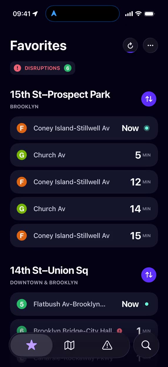
The app features just three primary tabs: Favorites, Map, and Alerts, with search as a secondary option. Users see the latest times at their favorites the second they open the app, for quick reference.
Realtime Arrivals

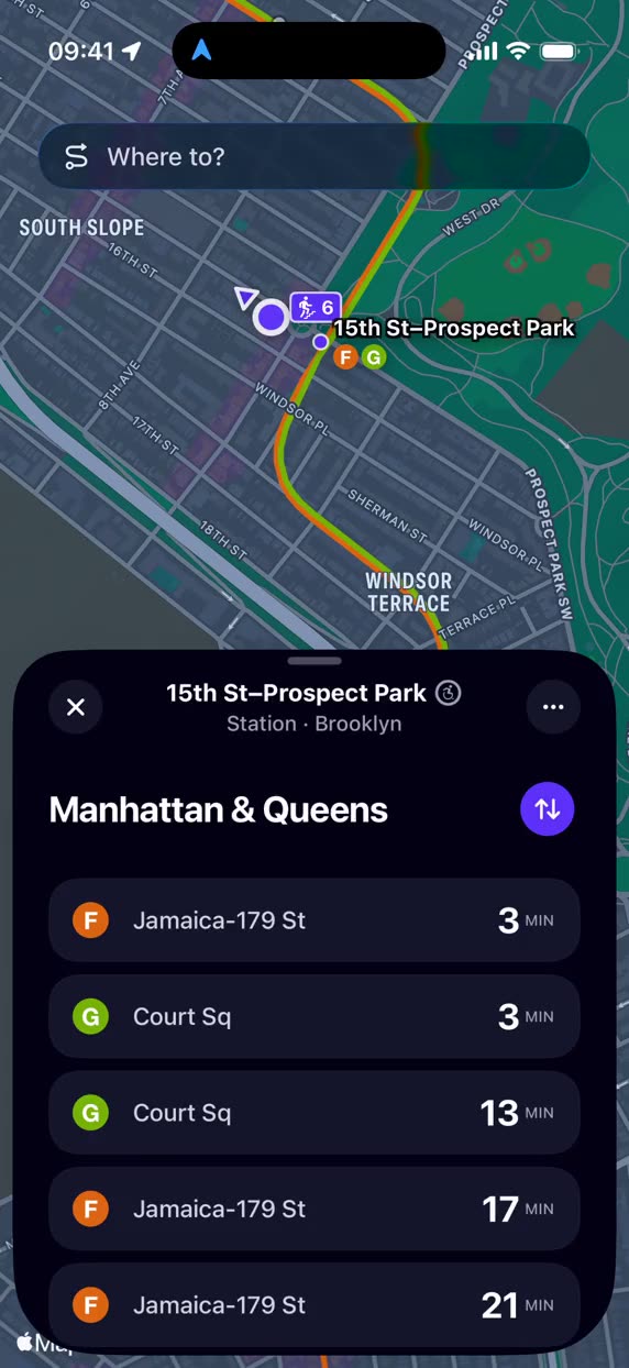
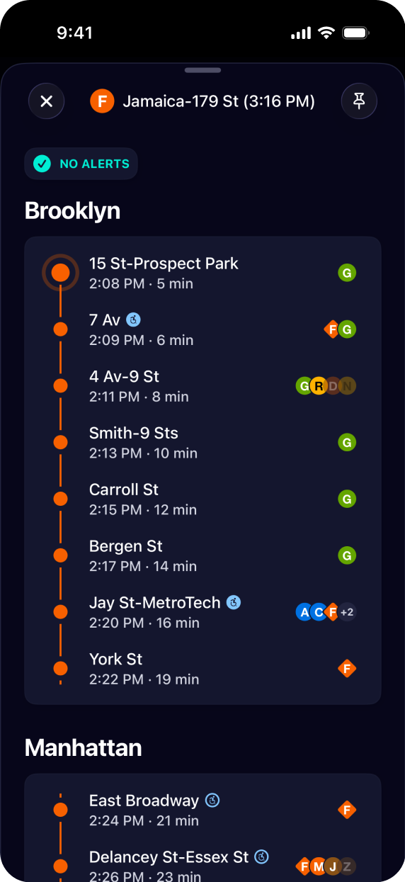
MTA GTFS-Realtime snapshots, pulled fresh every 45 seconds. View a timeline of any arrival, including every stop still ahead of it. Pin it and it docks in a banner so you keep that exact train.
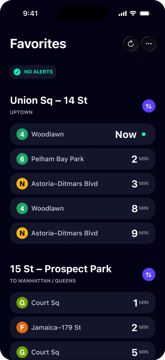
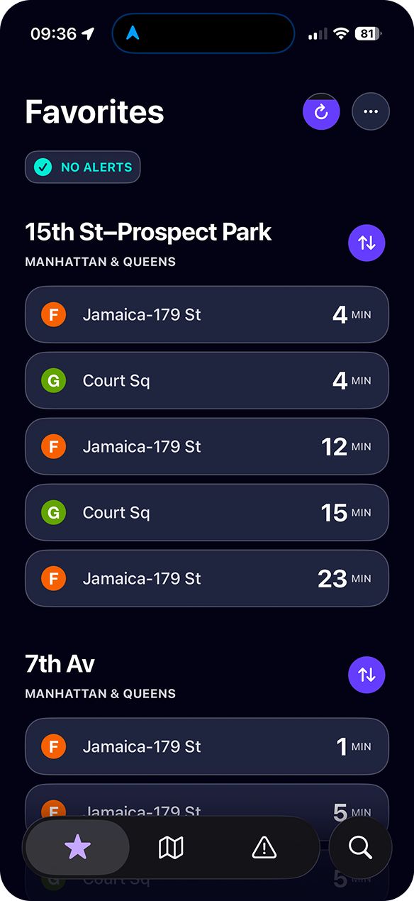
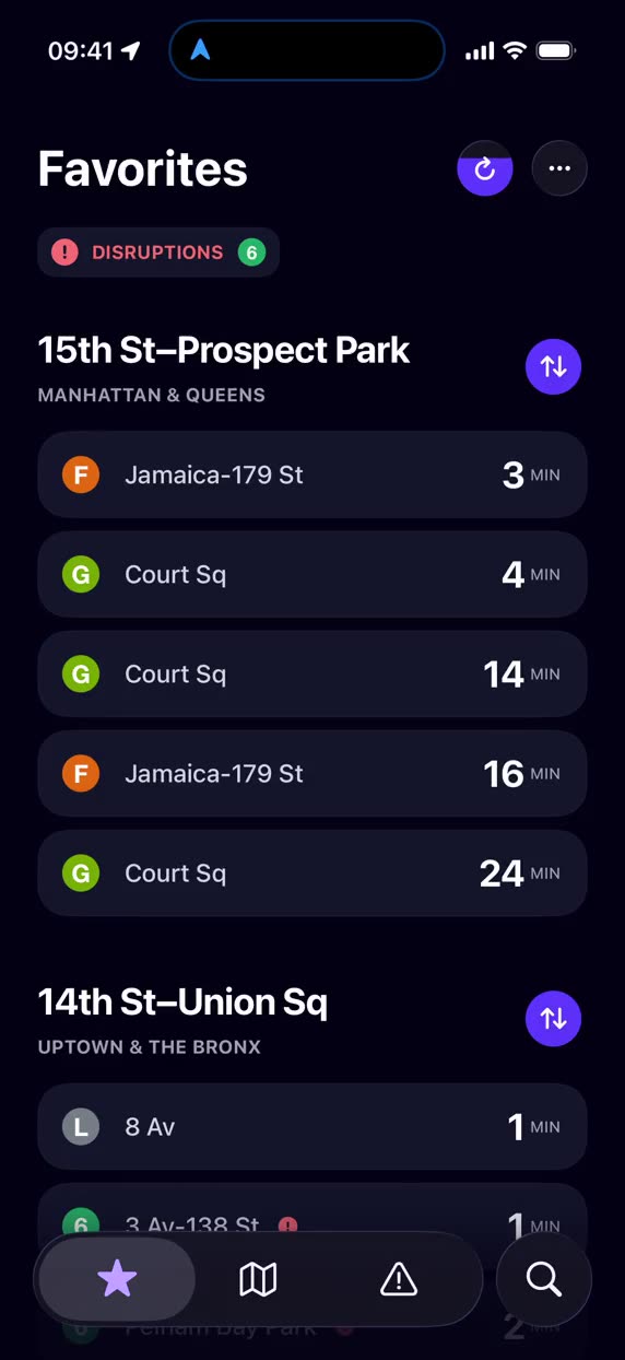
The Favorites list, showing live countdowns for two saved stations
A pinned train's timeline, listing every stop still ahead of it

Countdowns & Layout

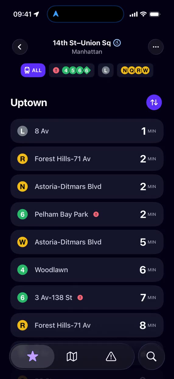
Train times update and pulse smoothly, resembling a live ticker board. Switching platforms or sheet detents feels similarly buttery, inspiring confidence in what you’re using.
Map & Trips

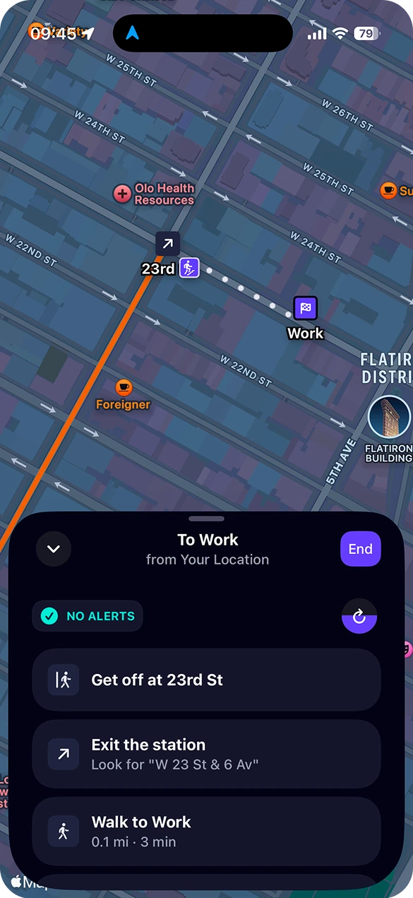
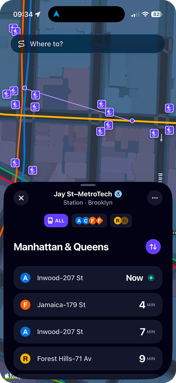
Every station drawn over MapKit in the real route colors—tap a stop and a sheet slides up with its live arrivals. Routing runs entirely on device: a graph built from the local schedule, with a service-alert overlay applied as it solves, so disruptions actually shape the route.
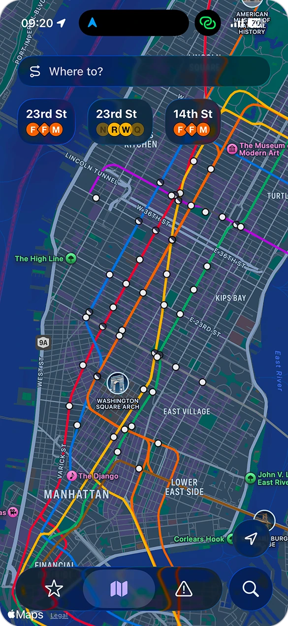
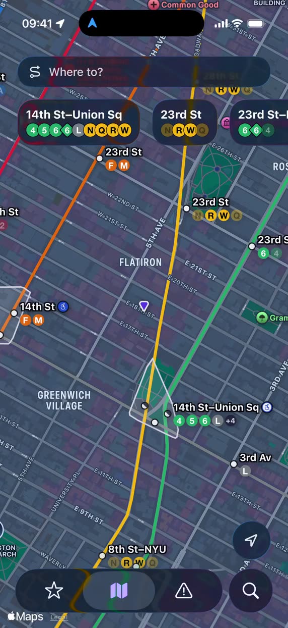
The full subway map, every station drawn in its real route colors
A trip in progress, with step-by-step guidance in a sheet

Enriched Alerts

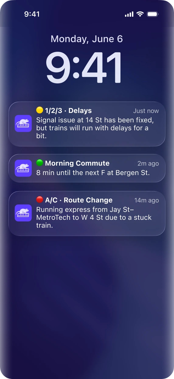
MTA alerts arrive as all-caps jargon, so a server-side pass rewrites each one in plain English before it ever reaches the app. Subscribe to your lines and that same pipeline pushes them the moment they go live.
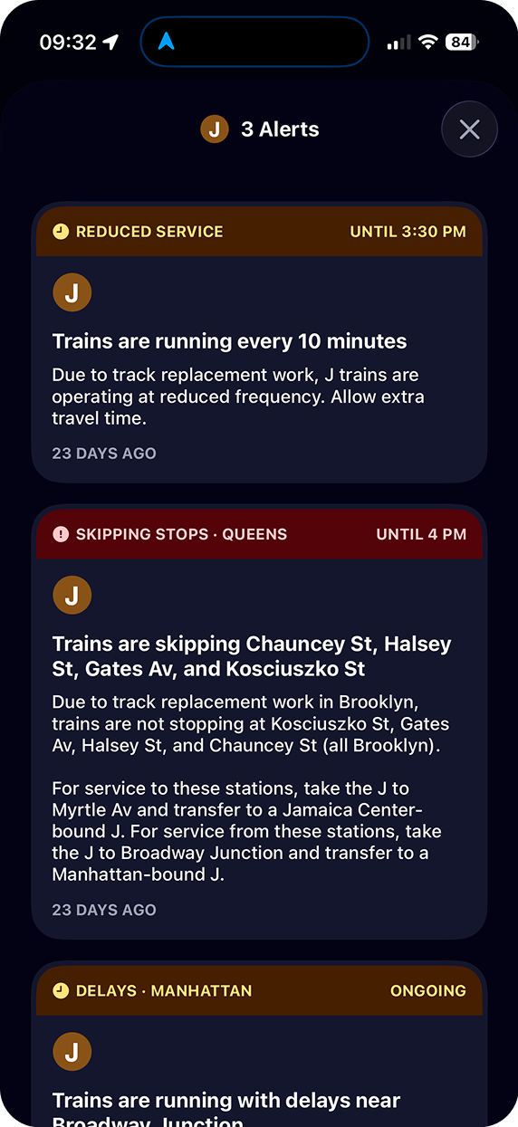
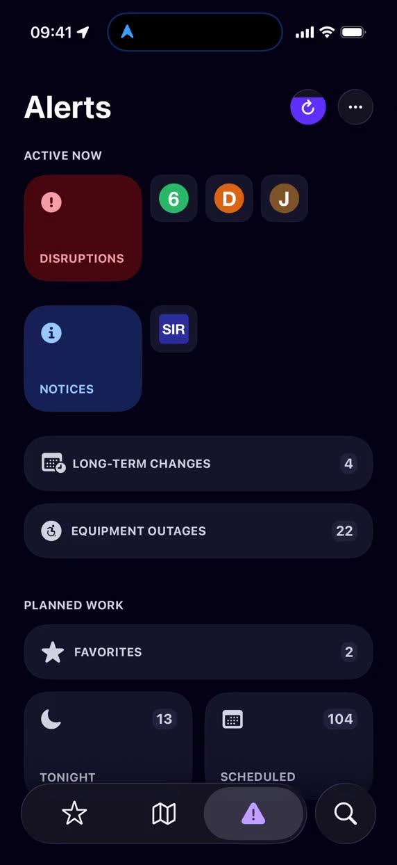
Service alerts for a single line, rewritten in plain English
Line alerts arriving as push notifications on the lock screen

Enriched Stations

I derive what a line actually serves: every real trip pattern deduped, then merged into one order that can't contradict a real train's sequence. Stations model three levels—platform, station, complex—so Union Square is one big stop, not three separate ones.
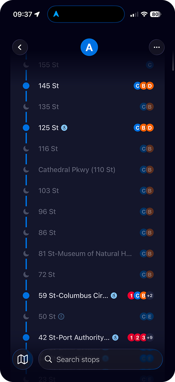
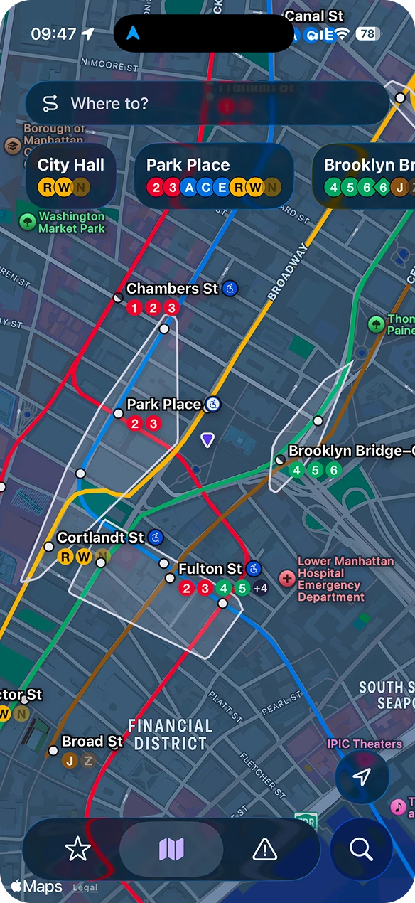
Every stop a line serves, in order
The map zoomed in, stations labelled with the lines they carry
A station complex as one stop, with arrivals across all its lines

Accessibility

The app is accessible by default. Route trips through stops with elevators, check live equipment status at any stop, and more. Plus, VoiceOver, Dynamic Type, and Increase Contrast live in the design system itself, so the whole app adapts at once rather than screen by screen.
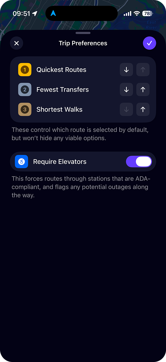
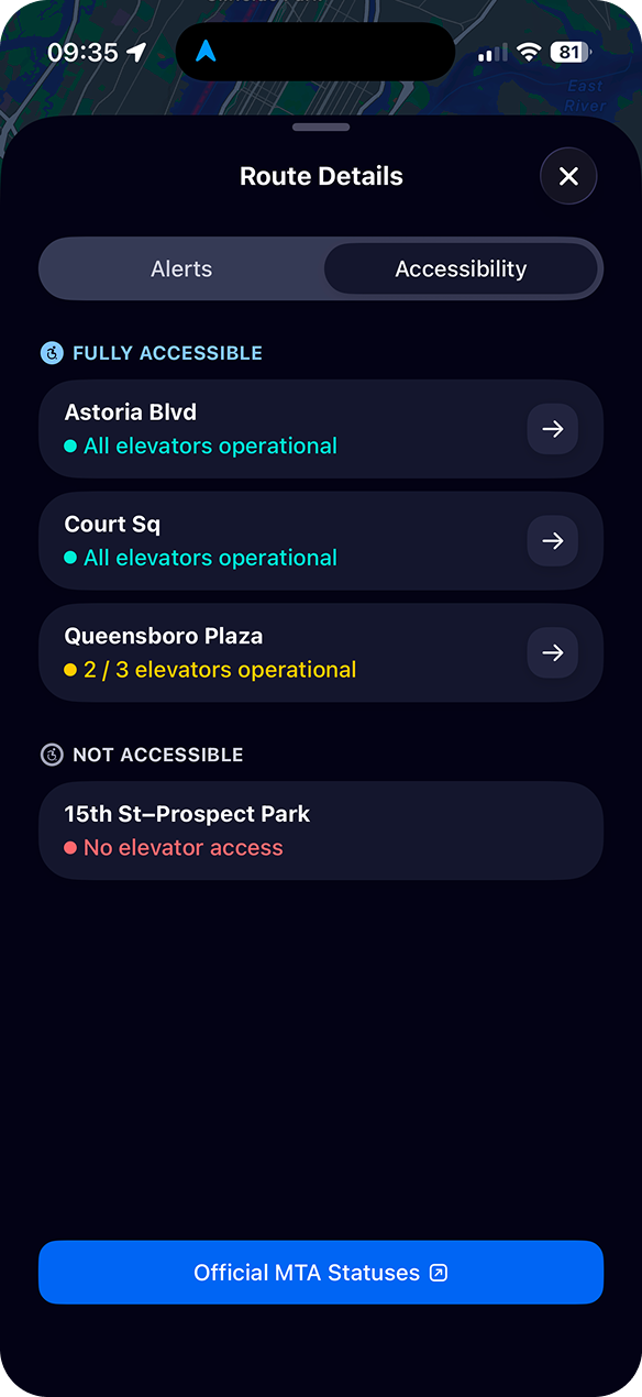
Trip preferences, including a switch that requires stations with elevators
A route's accessibility breakdown, with live elevator status per stop
The Favorites list with Increase Contrast turned on

Website

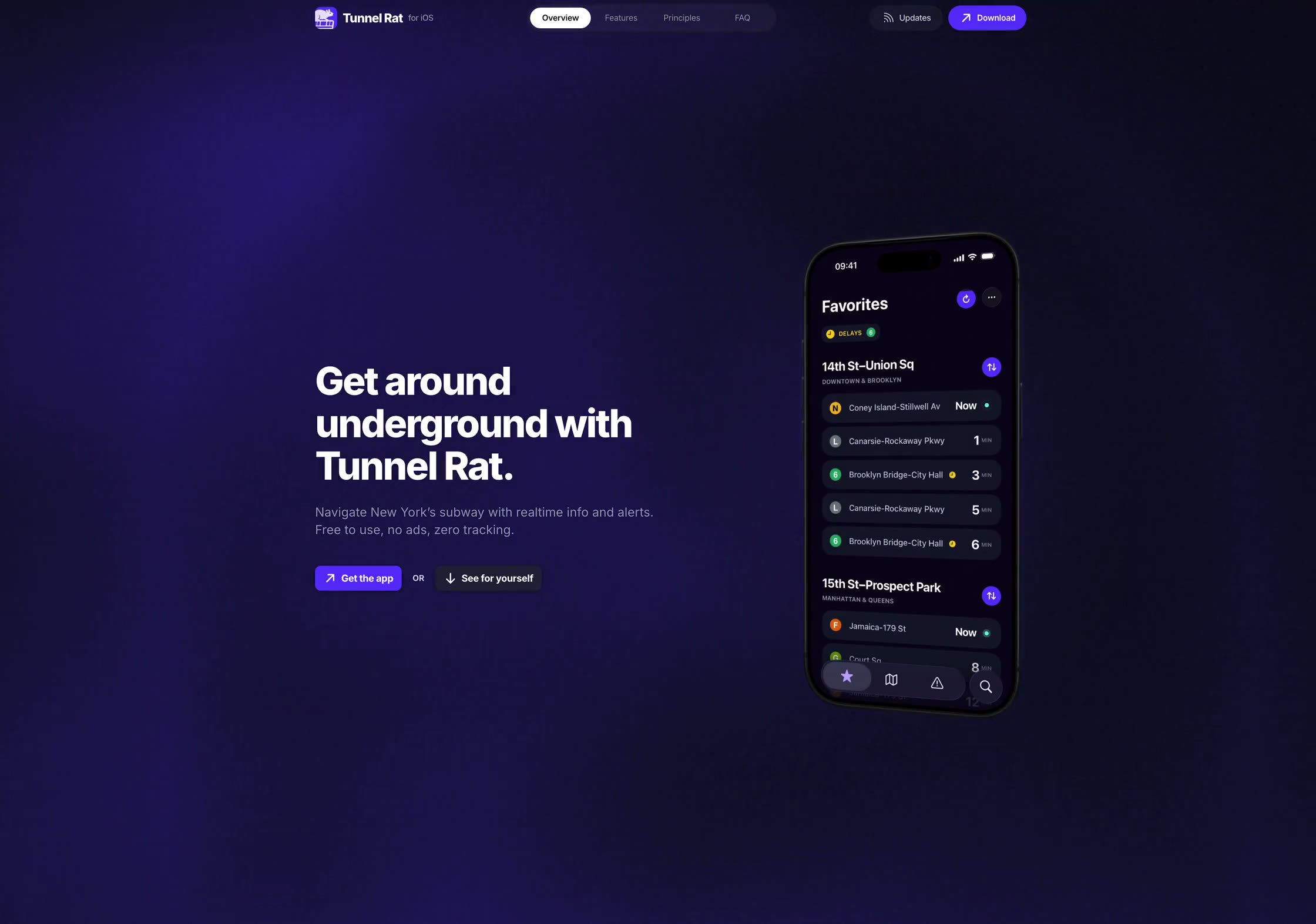
The Tunnel Rat site is a static Next.js build with a custom GLSL tunnel shader behind the hero, doing one job: explain the app and get you to the App Store. Its FAQ, changelog, and legal pages read from the same shared content repo the app bundles, so the two surfaces can't drift apart.

Landing Page

A bold hero lockup, featuring a powerful headline, quick actions, and short app demo. A faint tunnel-shaped shader peers through the background, paired with a dark theme in a nod to the underground.
Changelog

An automated changelog, baked into the ship process, gets updated and published anytime a new version of the app hits the store.
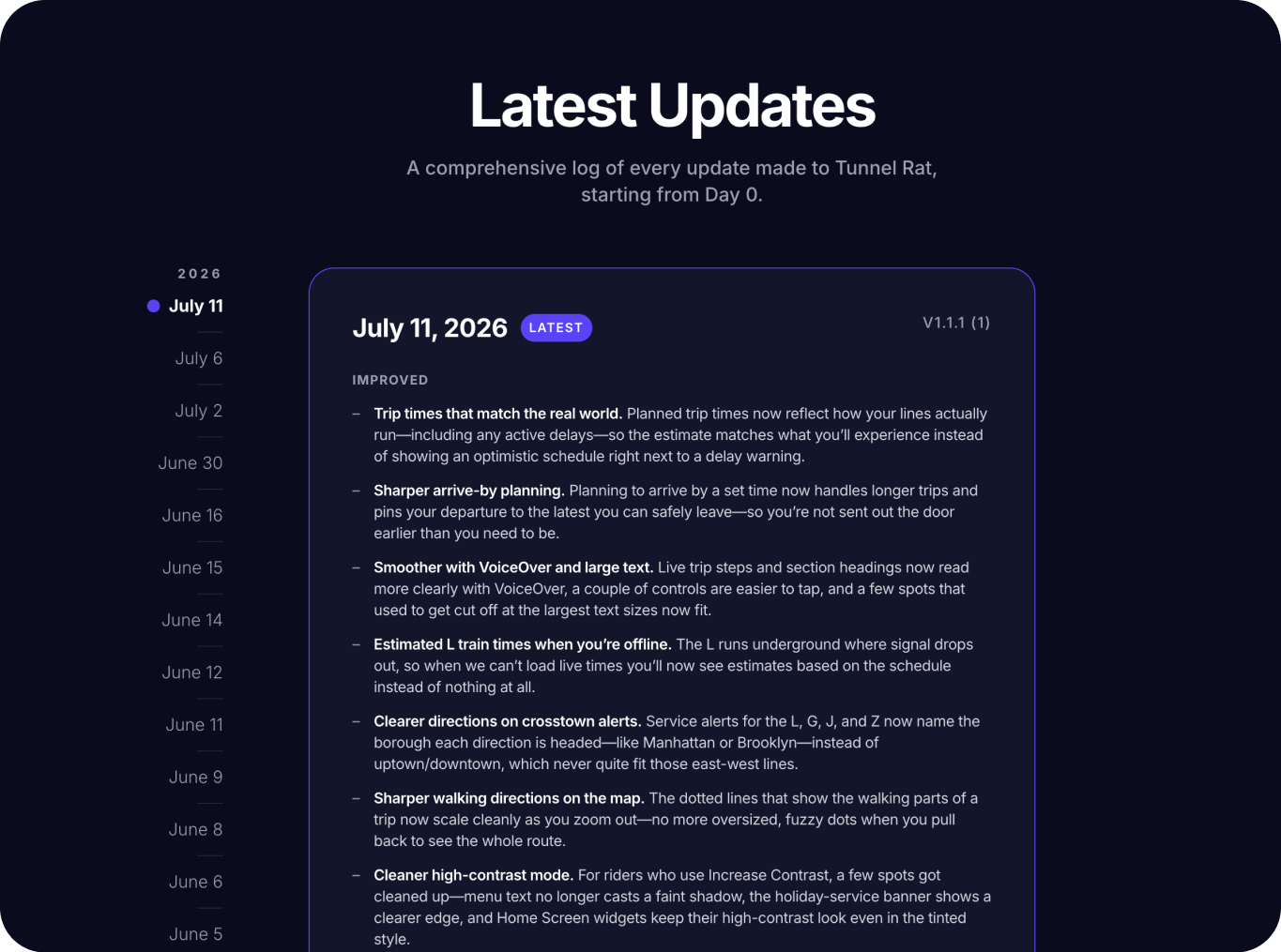
The Tunnel Rat changelog, listing every shipped version

Git Submodule

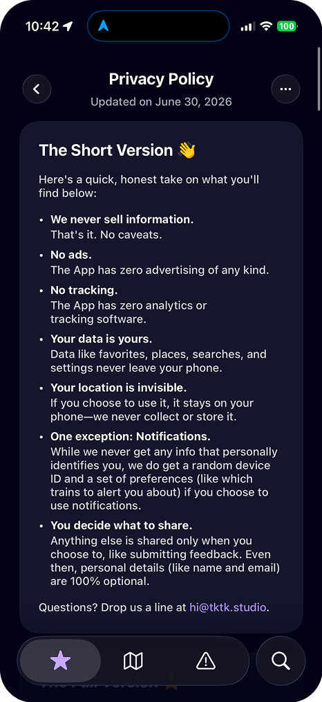
To manage shared content across the app and website—like the privacy policy, terms of service, and FAQ— I set up a git submodule, and baked a version bump into the ship skills for both surfaces.
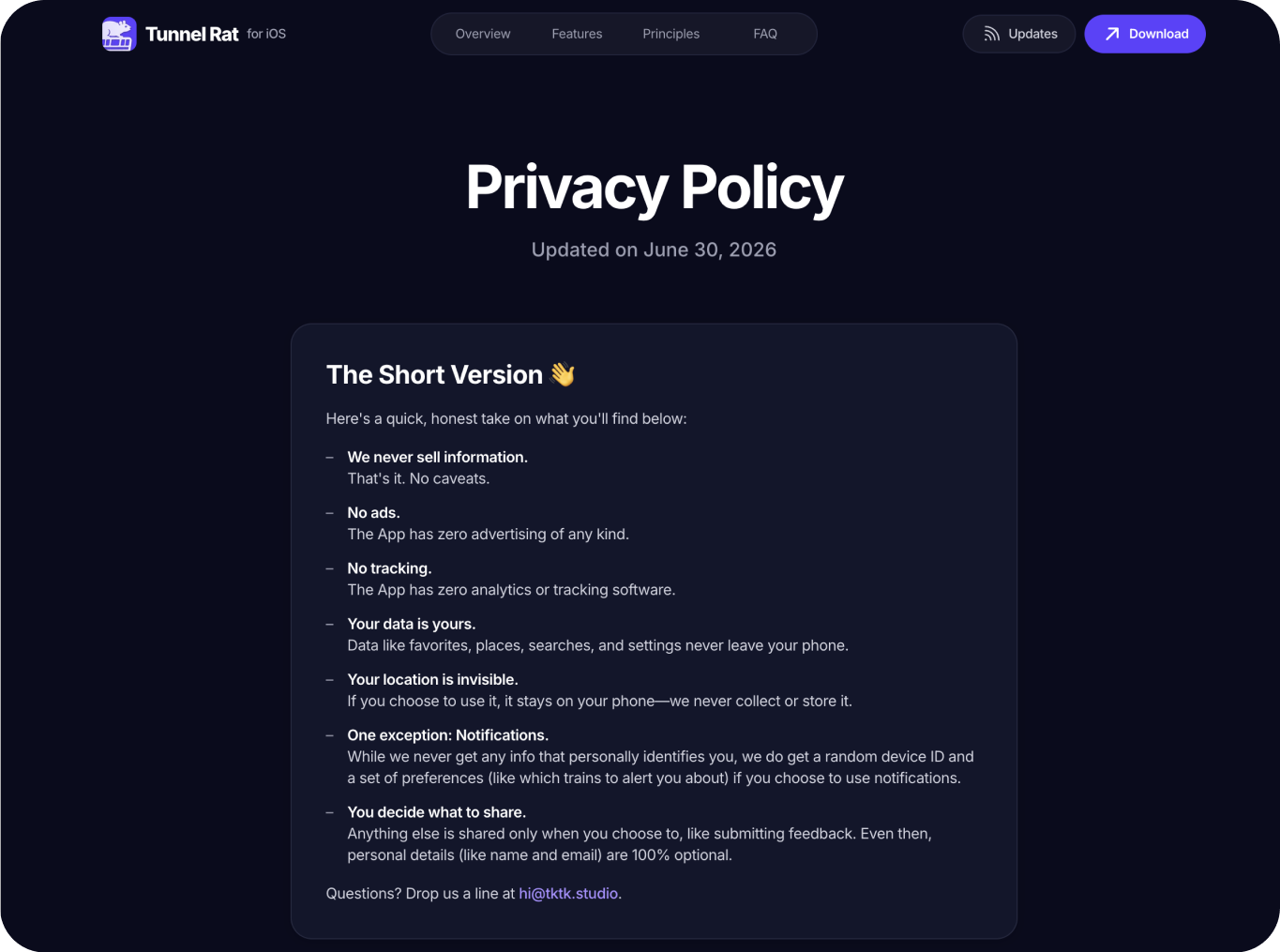
The privacy policy on the Tunnel Rat website
The same privacy policy rendered inside the app

Last updated