Skip to content

Figma Slides

The first storytelling app built for designers and their teams, together.
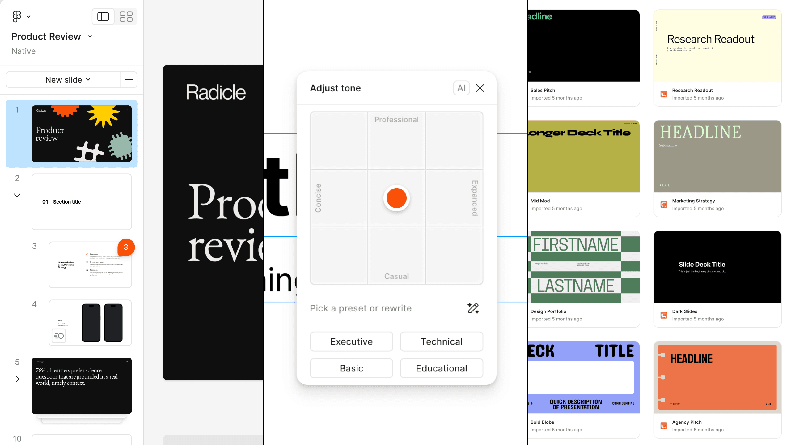
Three Figma Slides views side by side: the deck editor with a slide list down the left, the Adjust tone panel with its Concise–Expanded / Professional–Casual dial and Executive, Technical, Basic and Educational presets, and a grid of imported template decks

Context

  • Figma
  • Principal UX Writer
  • Dec '23 – June '24

Overview

Problem

We knew designers were already making thousands of decks in Figma Design, but it was tough for their cross-functional teammates to participate or contribute in such a design-centric environment.

Approach

Develop a dedicated editor for crafting presentations and decks, with a mix of simple, intuitive default tools and Figma's world-class design capabilities—a space for the entire team.

Ownership

I played a hybrid designer-writer role, split between:

  • Design: Templates, onboarding, AI features, launch assets.
  • Content: UX writing, type/style naming, tooltips, keyboard shortcuts, etc.

The team included:

Decisions

1. AI Strategy

Slides needed an AI feature, but only if it was genuinely useful. The obvious bets were image and layout generation—the flashier options, and the ones every other tool was chasing. We went the other way and scoped to text, where LLMs were already reliable and where our timeline gave us a real shot at shipping something good. The tradeoff was explicit: Slides would help you write a presentation, not design one.

That left the harder question of how. Rather than generate finished copy, we bet on a flexible model that let people push tone and length until something fit—the Tone Dial, a joint idea with another designer on the team. I defined its language axes, which I get into below.

2. Template Content

Research showed that the non-design audience leaned heavily on templates to get started, which meant we'd need our own. I managed an agency through exploration and a first draft, then polished and produced the final assets. But one question was mine to answer: what should the placeholder content actually say?

The generic answer is "Title" and "Body." I went the other way—every layer should teach the slide it sits on. "A bold, memorable headline," not "Title." Opinionated content is a bet: it has to be right, and it's far more work than filler. It also made each template self-explanatory, and made the whole thing sound like Figma rather than like any other presentation tool.

3. Shortcut Mental Model

Slides blended two modes—Slides and Design—and the two audiences arrive differently: designers with deep muscle memory, non-designers with none. So the call was whether to preserve Figma's existing shortcuts wholesale, or reset and pick more intuitive ones for everyone.

I split it by whether the mental model carried over. Switching props panels in Slides is the same act as switching props panels in Design, so those stayed identical and designers kept their reflexes where the parallel was real. Where the action was genuinely new, I chose intuition over consistency—⇧S for a new slide. Everyone was learning something regardless, since the tool itself was new; the point was to spend that cost only where it bought something.

Results

Launch & Reception

Slides was one of the flagship announcements at Config '24—Dylan closed the keynote by revealing he'd been presenting in it the whole time, and it got the loudest reaction of the show. The enthusiasm was real—millions of decks got made in the first year—but it didn't hold. Slides settled into being a nice-to-use product rather than one you'd upgrade for.

Growth & Adoption

While many saw value in Slides, the switching costs (from Google Slides, Canva, etc.) were high, particularly in sales & enablement. Since then it's been a slow burn, growing within teams who are already in the Figma ecosystem—a stickiness product, but not a monetization driver.

Monetization

Figma has never broken out a Slides revenue or usage number—not in the S-1, the FY2025 10-K, or any earnings call. Slides' job was never its own line anyway: it was raising what a seat is worth and deepening multi-product attach. I can't isolate what Slides contributed to either, and I'd rather say so than borrow a number the whole portfolio earned.

Learnings

1. Prompts need opinions, not guidelines.

We built the first Tone Dial on standard prompt engineering guidance, assuming that would be enough. It wasn't. Describing the characteristics we wanted gave us outputs that were close but never quite right. What worked was going narrower than felt comfortable: two explicit axes, tone and length, with clear polar ends and room to move in between. The lesson wasn't that prompting is an art—it's that vague instructions produce vague results, and the fix is almost always more opinionated, not more thorough.

2. Use the thing to build the thing.

We designed the first templates in Figma Design, because our agency partner couldn't access our internal build of Slides. The constraint was real; routing around it was the mistake. We paid for it twice: every template had to be rebuilt in Slides to get styles and variables applied correctly, and we gave up the chance to watch a room full of designers use the product cold. The agency was our most available set of real users and we spent months not learning from them. We eventually got them access—we should have started there.

3. Workflow inertia beats feature parity.

We made switching cheap: copy and paste your content in, start from a template. It didn't matter much. From customer conversations and a lot of casual ones, my read was that people weren't weighing features—they were weighing the cost of being the person who made their whole team change how they work. Their existing tools had plenty of pain points, and familiarity still won. The thing to design against wasn't the competitor's feature list; it was the social cost of the switch.

Toolkit

Composition

  • Figma
  • Figma Slides
  • Warp

Workflow

  • GitHub
  • Asana
  • Slack

Specs & Details

AI Features

As part of the beta launch, we added two novel AI features—both exclusive to Slides, at the time—to help folks craft exactly what they wanted. Designed by Natasha Tenggoro and yours truly.

Tone Dial

We created a novel interaction model for editing text with AI, letting users drag a handle across two axes to find the tone and length they wanted. I drummed up the content framework—the two axes and four keywords you see here—and polished the behind-the-scenes prompt details to make this thing work as expected.
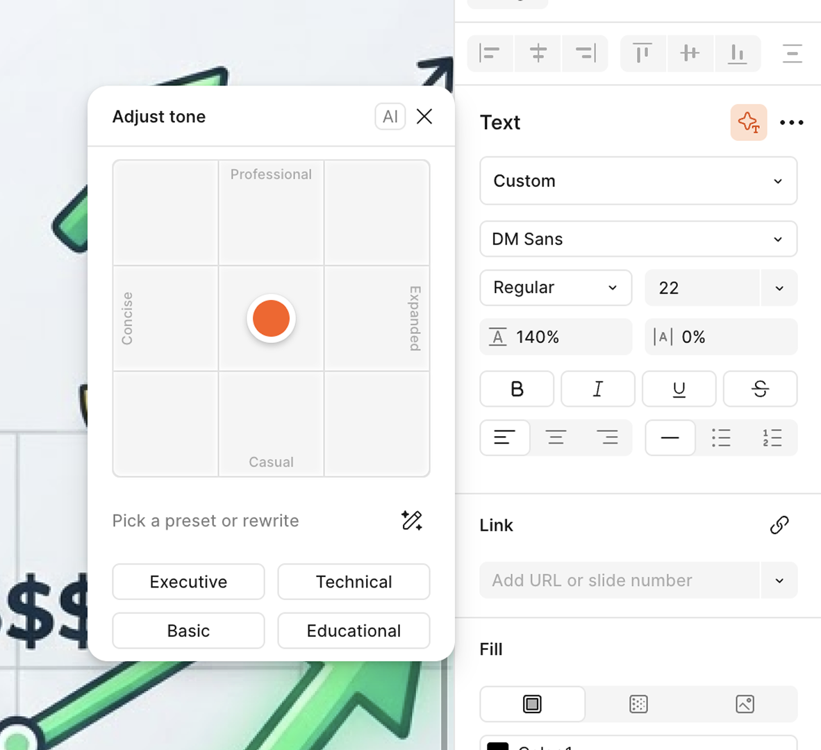
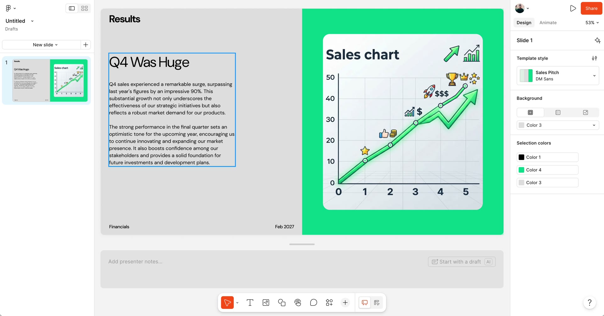
The Adjust tone panel and its two-axis dial

Board to Deck

Instead of starting cold, we let users pick a FigJam board to use as an outline for their deck. We optimized a few of our templates for this specific use case, to make sure the output was always crispy. I worked to make sure our templates were crafted in a way that agents could understand, which ties to the content strategy below.
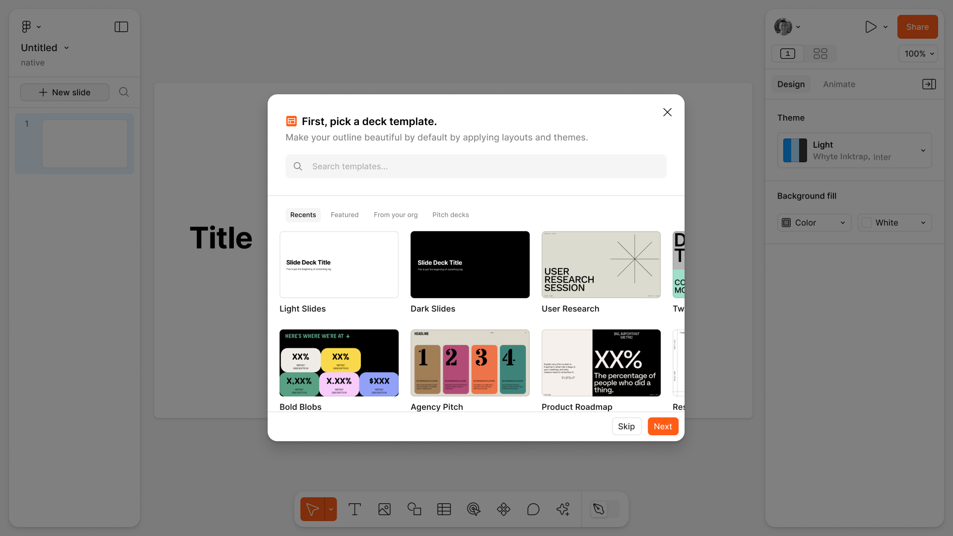
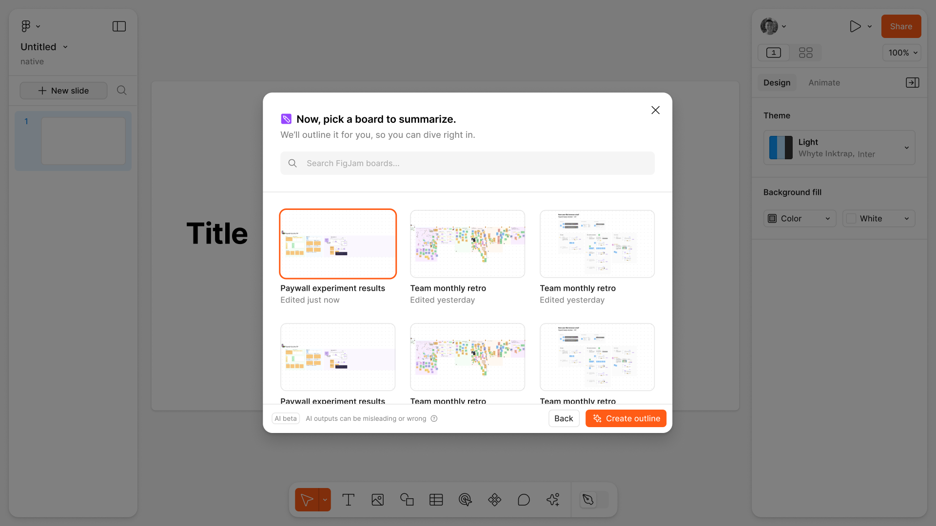
Picking a FigJam board to summarize into a deck
The generated outline, laid into a template

Templates

I led creative direction and production on our 20 launch templates. We worked with an agency on initial strategy and creative, and I polished and produced the final deliverables. The result was a big batch of high-quality templates, making it easy for anyone to dive right in.

Launch Templates

20 distinct templates, spanning various use cases and styles, and configured to be as usable and accessible as possible. Template naming centered around either use case or vibe, depending on the template's purpose.
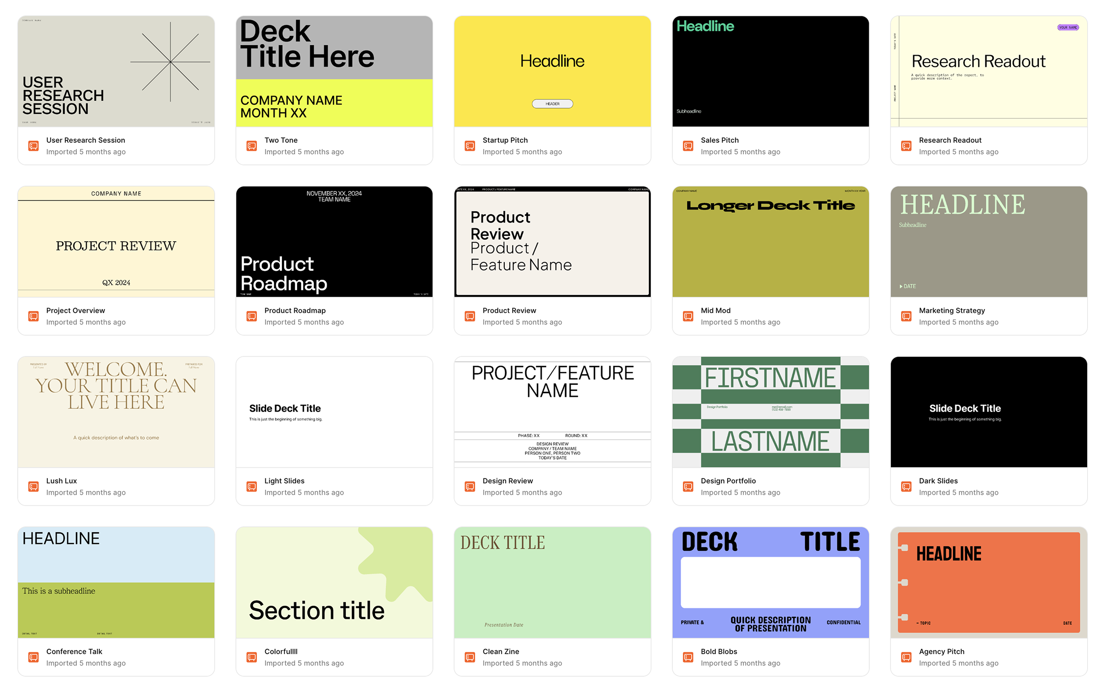
The twenty launch templates

Content Strategy

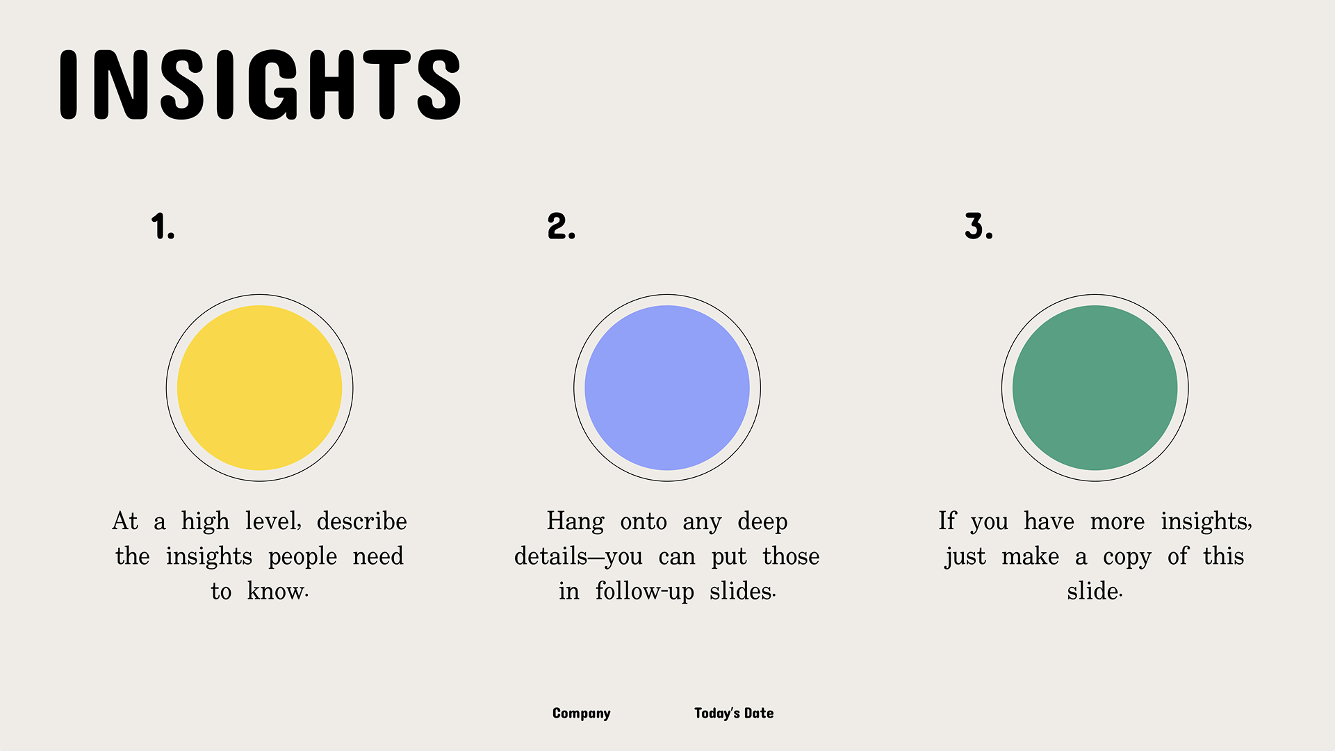
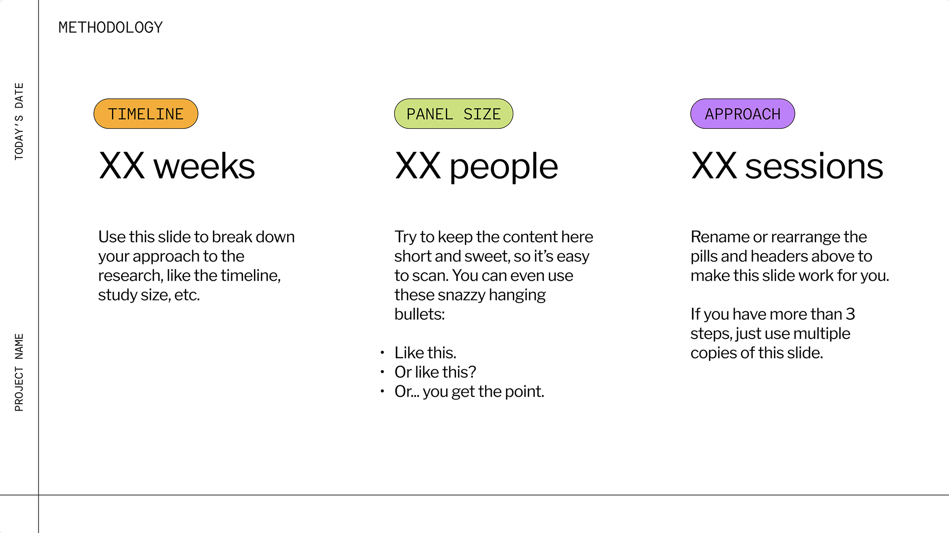
I used placeholder content in each template to provide guidance around how to use them, with varied voice and tone to match the vibe of the deck. This achieved two results: (1) the overall product felt more welcoming and inviting, particularly for brand new users, and (2) our agents had clear instructions when using the templates to generate slide decks using FigJam board content.
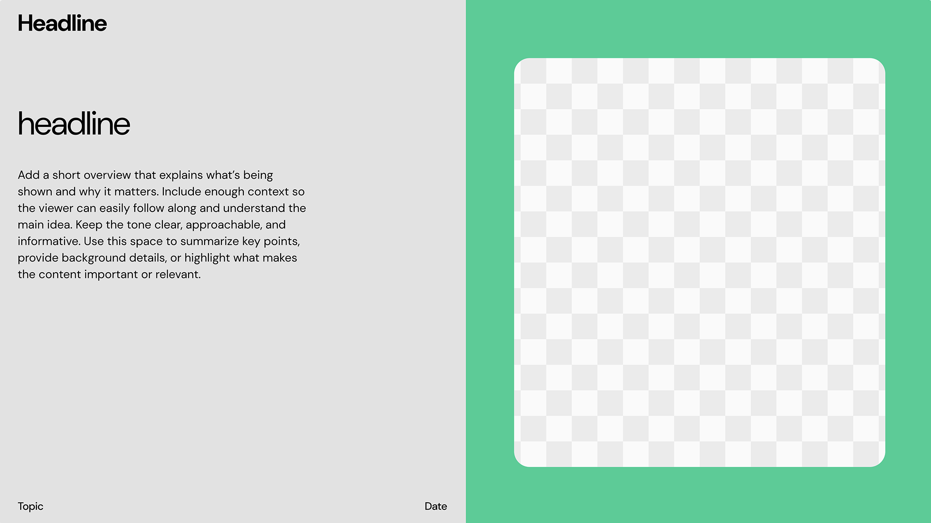
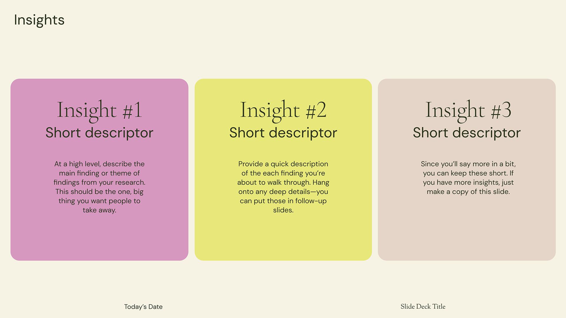
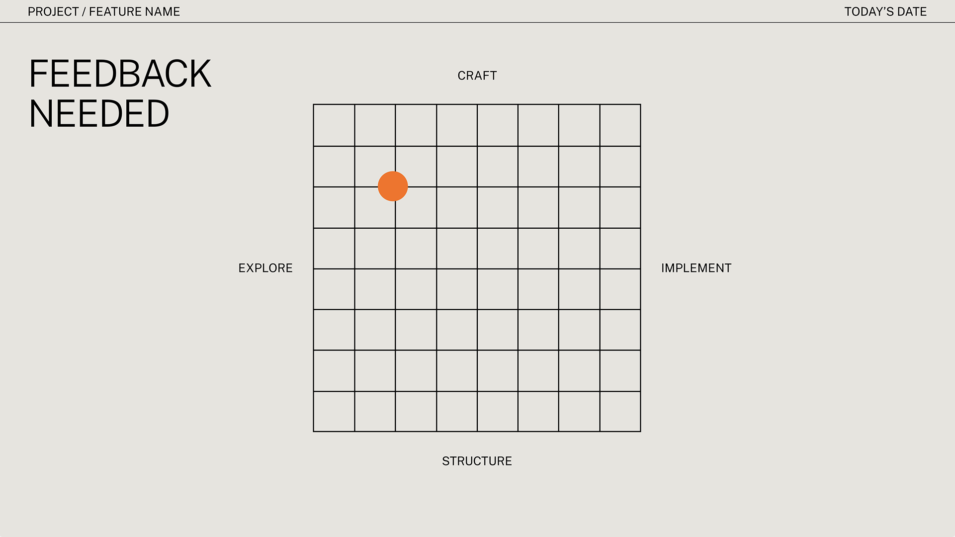
Placeholder content guiding how to use a template
A template's voice matched to its visual style
Guidance written into a section divider
Placeholder copy on a data slide
Instructional text on a closing slide

Template Selection

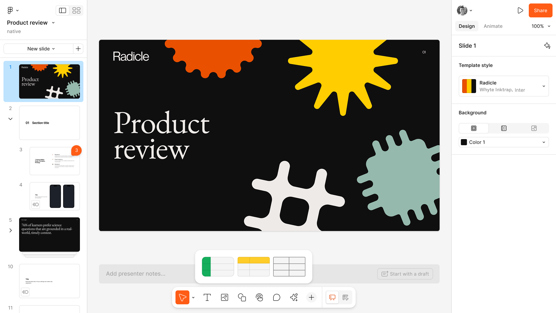
When creating a new file, you can pick a template to start with. You can also pick individual slides from any template at any time, so you can evolve your deck as you go. After trying a few different options, we chose to avoid naming individual slide types, as it added a ton of visual noise for very little value.
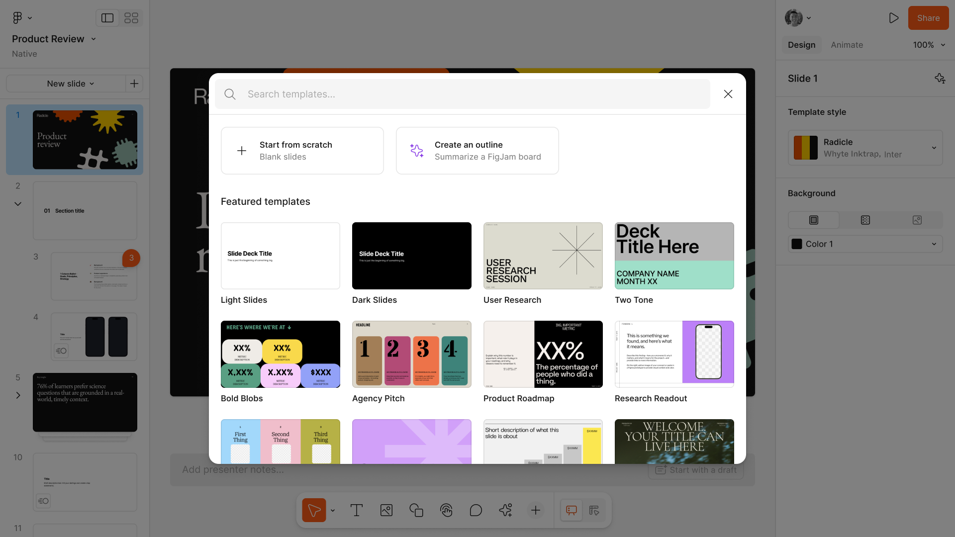
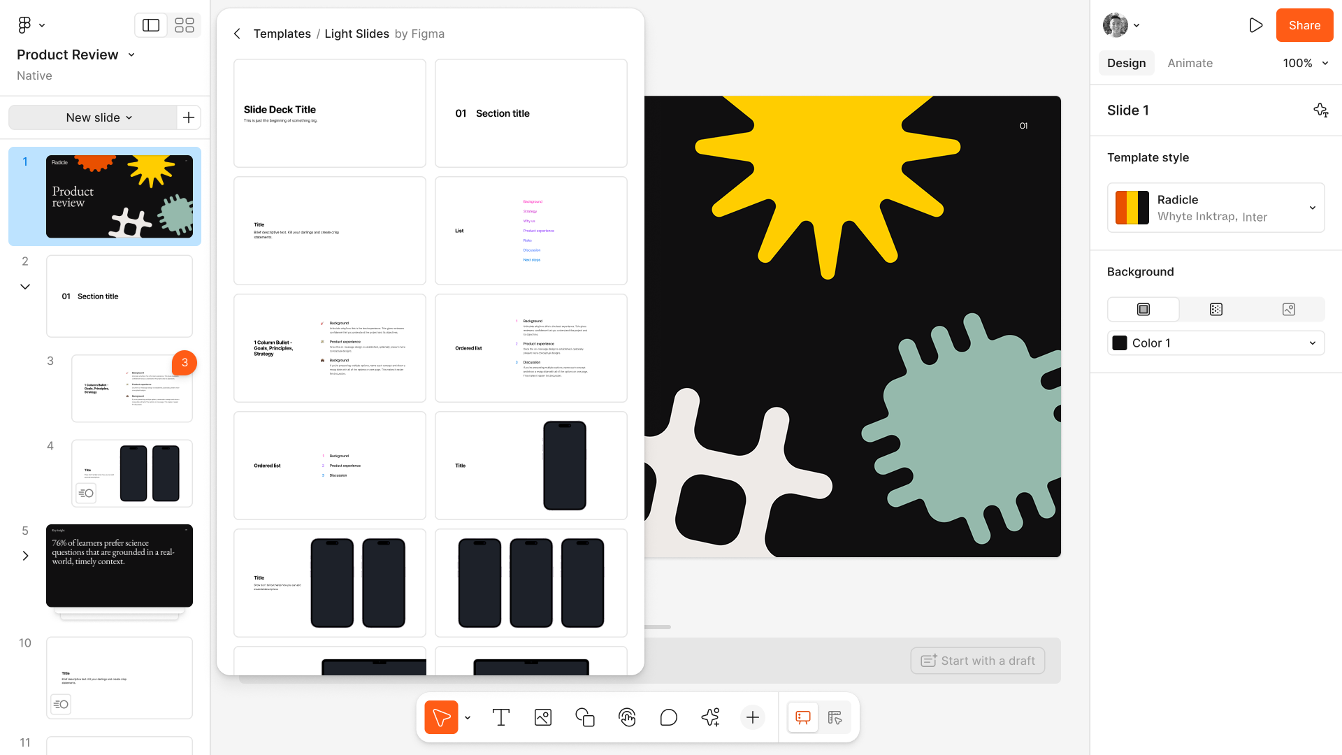
Picking a template when creating a new deck
Pulling individual slides from any template

Team & Community Templates

We later added the ability to publish templates to your internal org and to community, dramatically increasing adoption of the feature across the board—particularly within larger orgs. This allowed teams to keep decks on-brand no matter who was creating them.
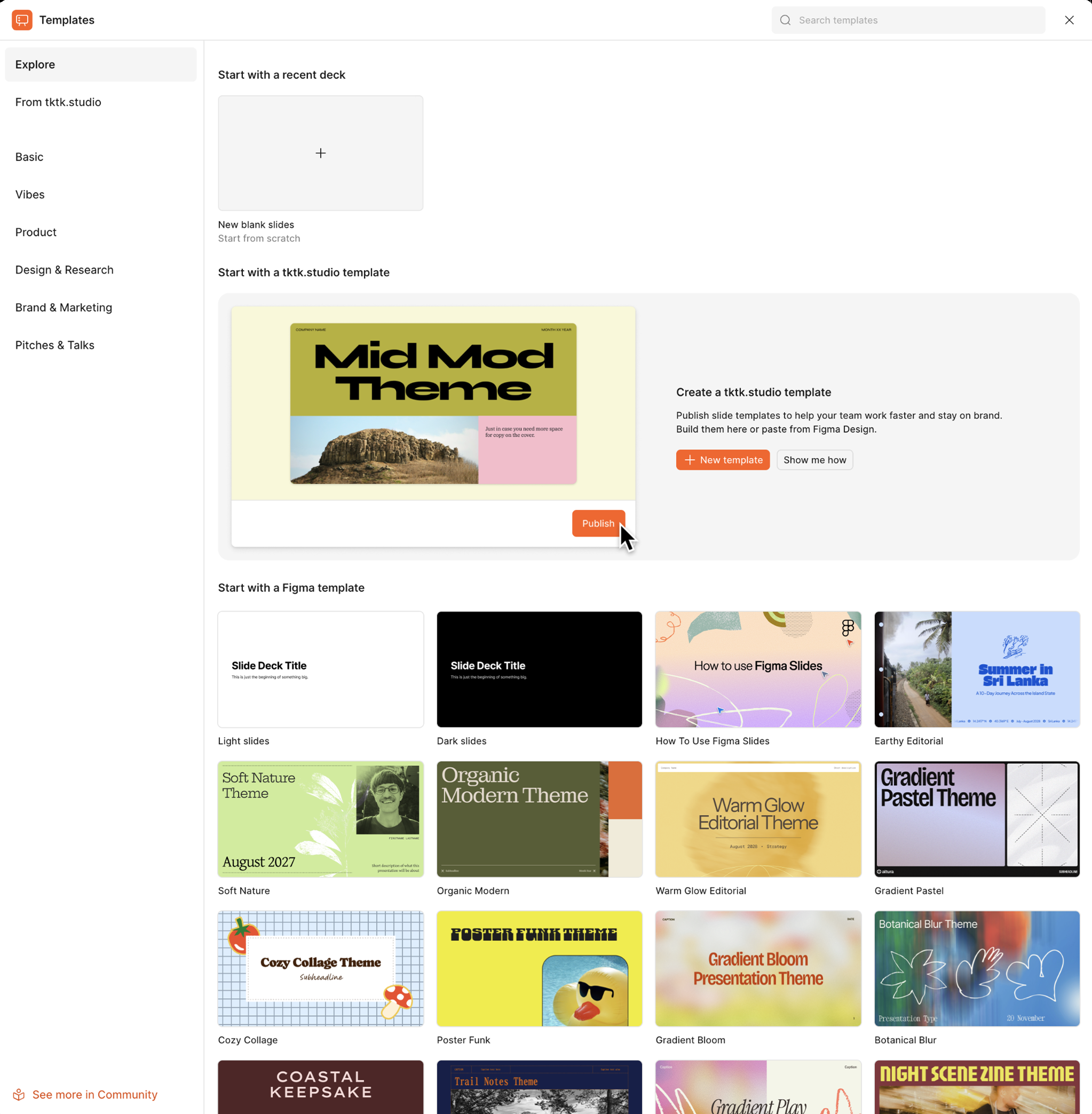
Publishing a template to a team or to community

Core IA / UX

Figma Slides was designed to take advantage of everything Figma already does well—creation tools, components, design systems—while providing the structure and organization of a traditional presentation tool. The simpler, default Slides mode makes it easy for anyone to create a deck, with Design mode on click away for the designers in the room.

Single Slide + Grid Views

Slides is grounded in two views—one for focused design and creation, and another for outlining and organization. The combo of the two makes it easy to switch mental modes as needed.
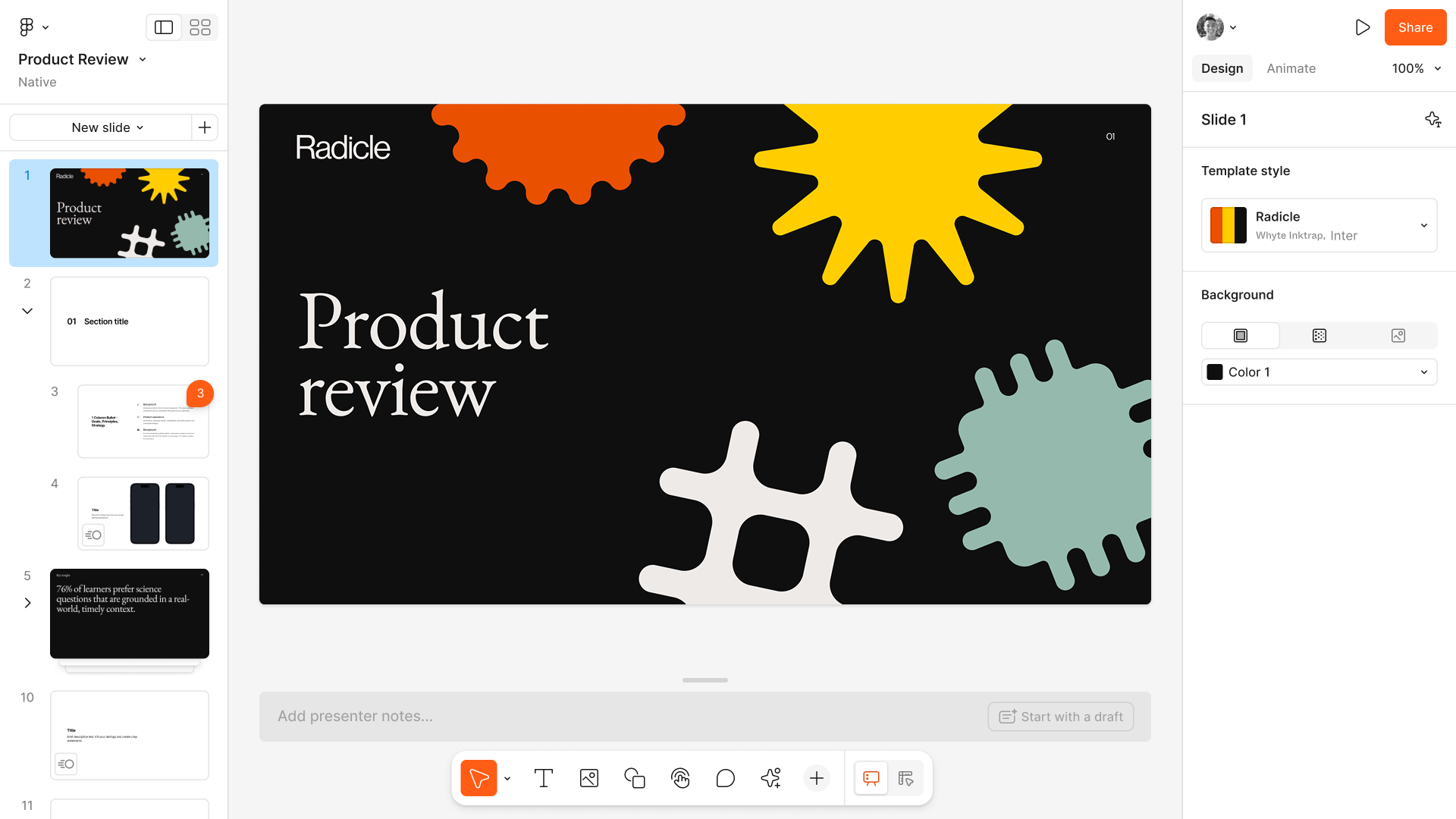
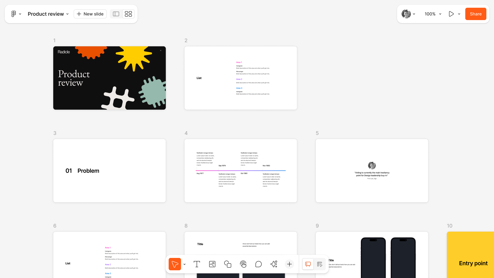
A single slide open for focused design
The grid view, for outlining and reordering a deck

Slides + Design Modes

To cater to both designers and their teammates, we added two different creation modes—a simpler, default set of tools, and Figma's classic, powerful design tooling—inviting everyone on the team to collaborate together.
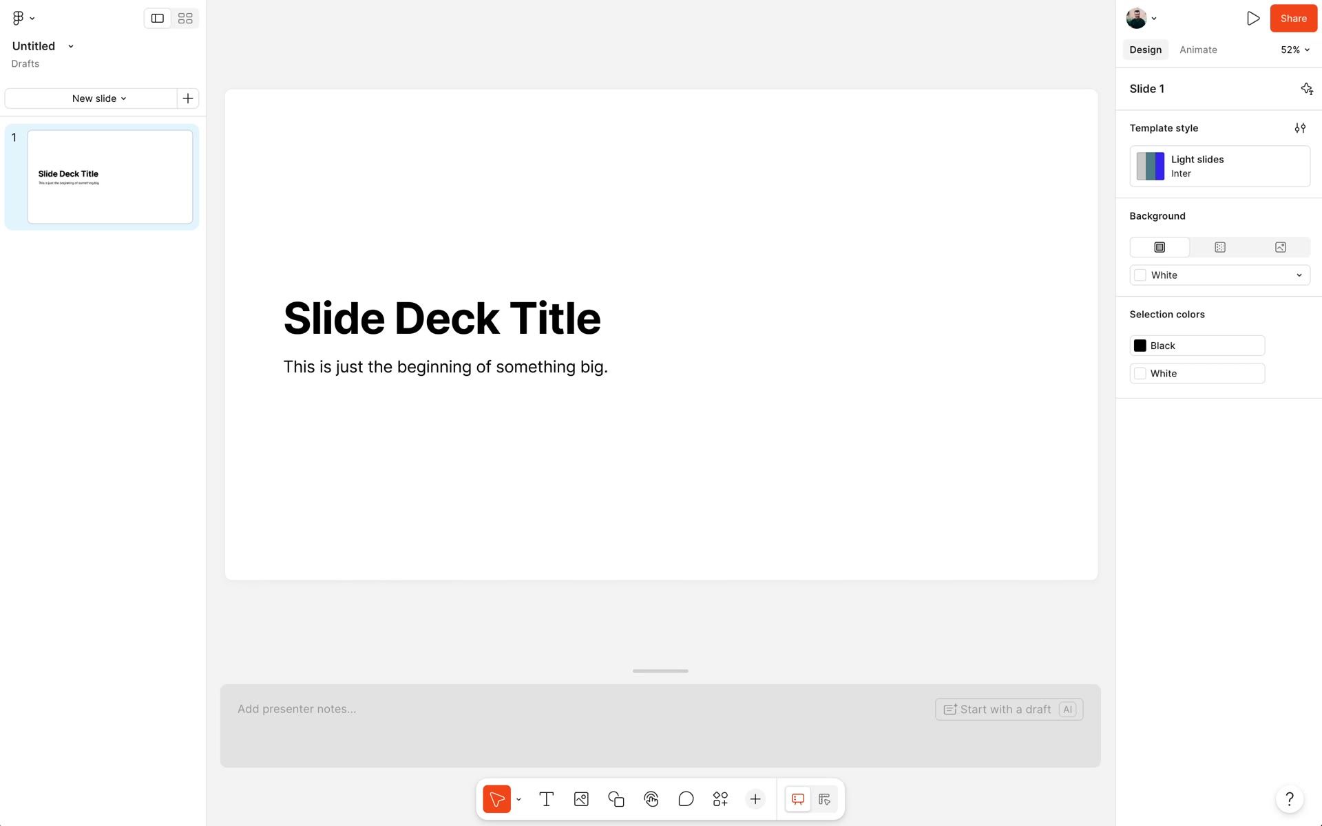
Toolbelt

The new Slides toolkit borrowed and built on FigJam's success, simplifying Figma's classic tools for a broader audience. Default type styles, smart shapes and connectors, and more.
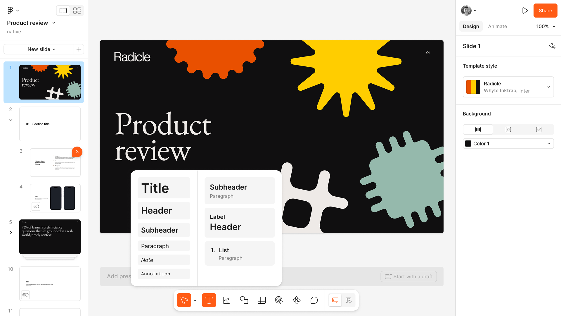
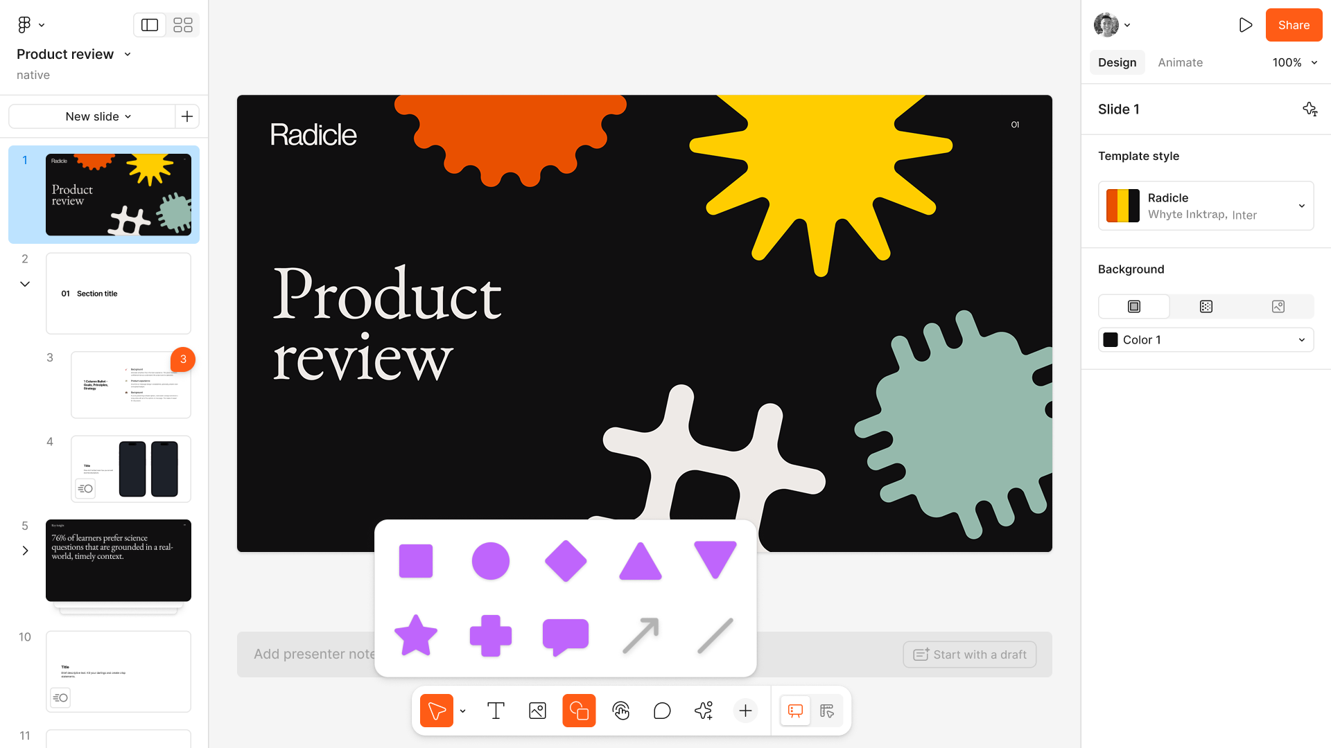
The Slides toolbar
Default type styles
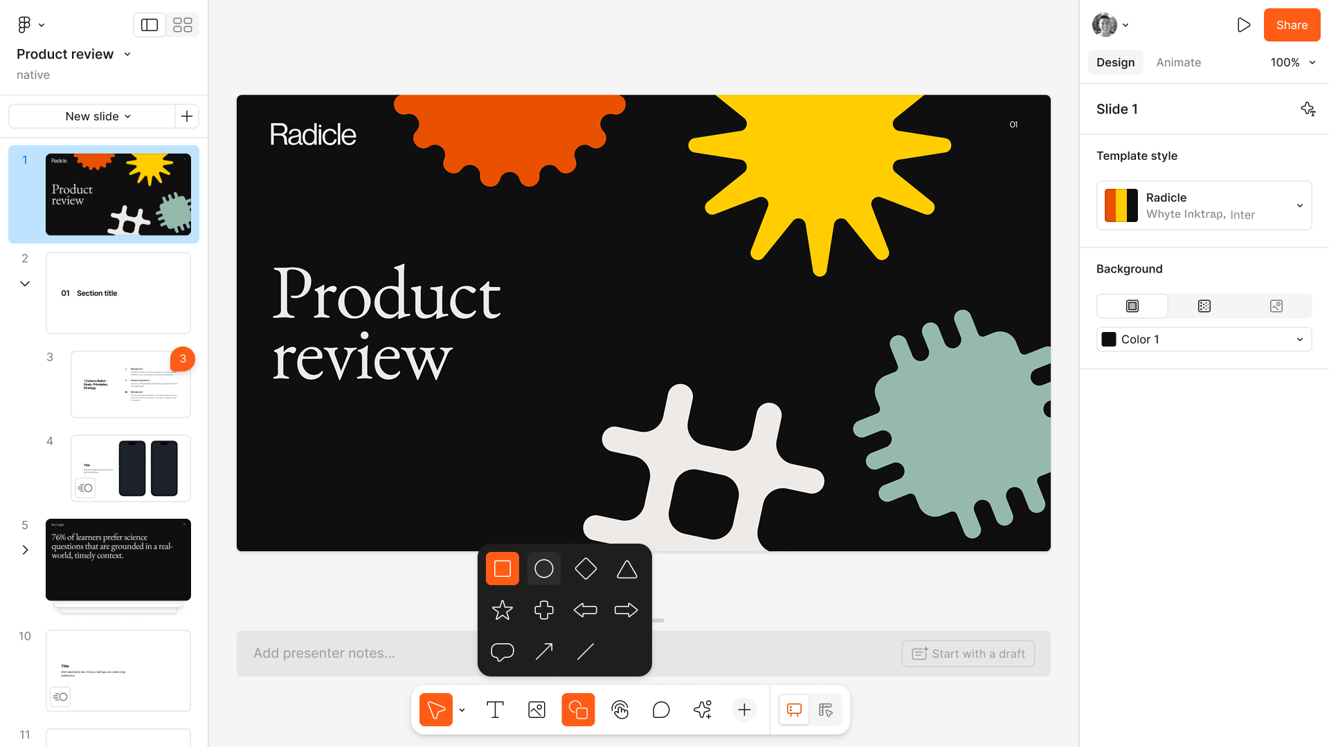
Smart shapes
Connectors between shapes
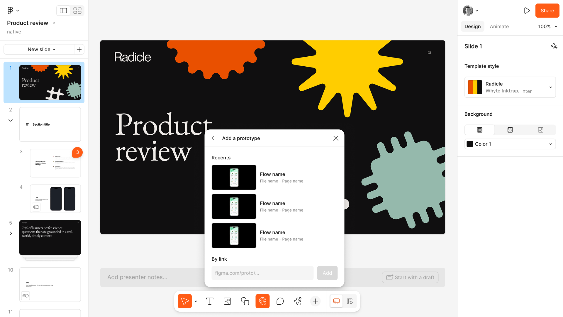
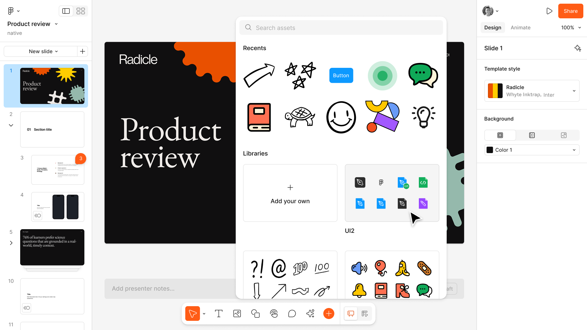
Media and embeds
Annotation tools

Presentation

To formalize the presentation process, we gave presenters two windows: one to control the preso and view speaker notes, and one to display the deck itself. I focused on differentiating the two views through CTAs, tooltips, and browser tab naming.
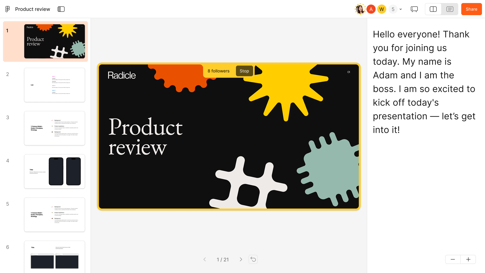
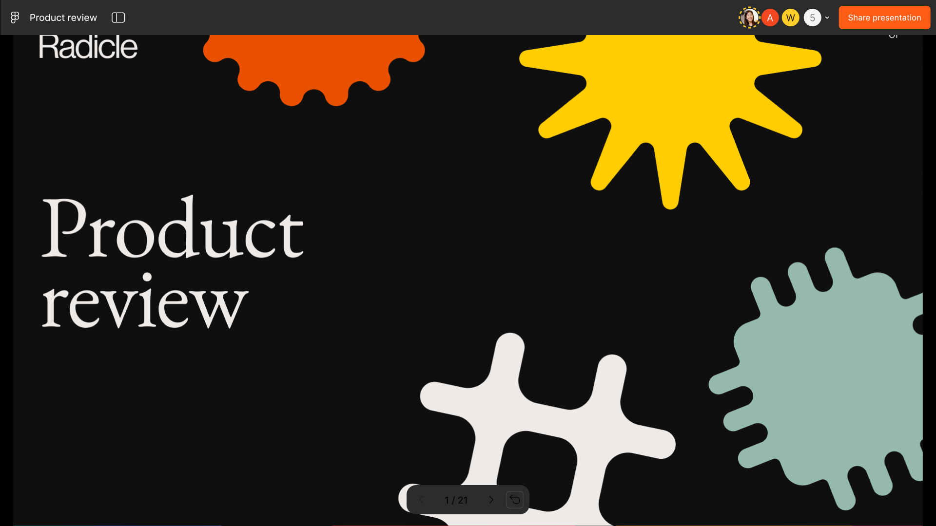
The presenter window, with notes and deck controls
The audience window, showing the deck alone

Last updated