Skip to content

Figma Sites CMS

Create and manage content for your site at scale.
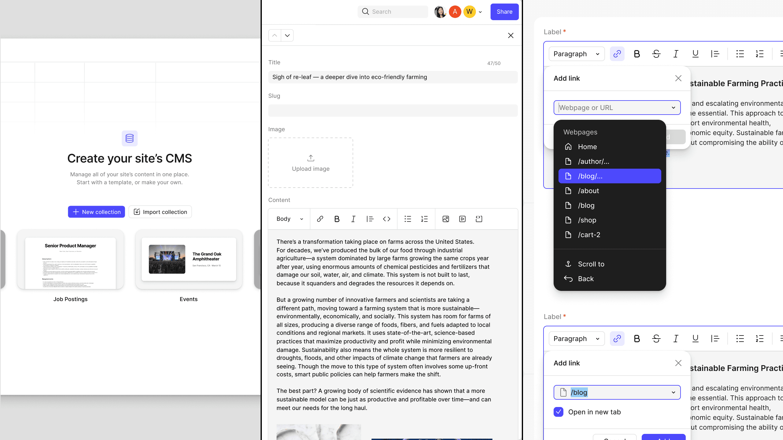
Three Figma CMS views side by side: the “Create your site’s CMS” empty state offering a new or imported collection, an entry editor with title, slug, image and rich-text content fields, and the rich-text link picker listing the site’s own pages

Context

  • Figma
  • Staff Product Designer
  • Apr '25 – Apr '26

Overview

Problem

Figma Sites launched into a category Framer and Webflow had defined: design-tool-native website building. It shipped without a way to manage content at scale, and the feedback came fast—people needed collections for portfolio project pages, blogs, product catalogs. A CMS built into Sites was the obvious answer, not as a standalone product but as a layer on one that was itself only a few months old. Its absence was a major adoption blocker on top of being a gnarly technical problem.

The design challenge was the canvas. Everything in Figma is directly editable, inline. But a templated CMS page isn't WYSIWYG by definition—it's one representation standing in for what might be dozens of pages. Resolving that tension in a way that felt intuitive and was actually buildable was the job.

Approach

We came at it from two angles: canvas interaction and content management.

The canvas had to stay true to Figma—directly editable, with all the tools, properties, and flexibility people already expected. The CMS layered on top: hooks in the design that propagate to every connected CMS item. Content was the opposite kind of surface, built for text and language rather than visual editing. Connect the two and you have a CMS.

Ownership

Designer Kelly Li started the project a few months before I joined and drove the core experience. I owned many of the layers built on top of it: Rich Text, content publishing, AI features, onboarding, templates, import / export, and linting.

I was also working on Figma's Payload integration alongside this project, which made me the only person on the CMS team with a foot in both worlds. Payload had solved a lot of these problems already—we were learning CMS as we went, and I could bring established patterns and industry conventions in rather than reinventing them. Being that connective tissue was part of the job.

The team included:

  • Design: Kelly Li / Tee Hodgson
  • Product: Albert Song, Luke Zhang
  • Eng: Artem Pasyechnyk, Arjuna Hayes, Jon Yee Chuah, Jimmy Wang, and Robbie Zhuang.

Decisions

1. Rich Text Model

Rich text and layout don't map cleanly onto a design node. Editors need real formatting—headings, lists, emphasis, links—but a CMS page is a template standing in for dozens of pages, and formatting the design can't absorb breaks it.

Lexical set the boundaries. Building on it meant the node model and its assumptions about document structure were settled before design started, so the question wasn't what an ideal editor would do—it was how to map what Lexical gives you onto a surface it was never built for. Both obvious answers were bad: expose everything and layouts come apart; lock it down and writers get a tool that can't do their job. I designed the mapping in both directions—what rich text can express, and how the design responds to each case—plus a preview so editors saw the published result before committing. Where Payload had already settled a convention—both around content tags and blocks in rich text—I brought that model over rather than re-deriving it. The cost is that some formatting isn't available, and that we now maintain a mapping between two models that will drift as either one changes.

2. Publishing Model

Getting content people into Figma meant getting non-designers into design files. Marketers and writers needed to ship copy without waiting on a designer, and designers needed confidence that nobody would publish a half-finished layout on the way. Permissions alone don't solve this—they decide who can enter the room, not what leaves it.

So we split publishing itself: content changes could ship without shipping design changes. That meant reworking the core Sites publishing flow to understand CMS, which was work outside my surface and required getting another team to absorb it. Two publish paths is more surface to reason about than one, and we took that on to keep both audiences in the same file instead of separating them into different tools.

3. Automation

Getting started had to work for two very different people: a designer with existing Sites work, and a marketer with a spreadsheet and no designs at all. We built for both—pick or generate a template, import existing collections in a few formats, or start with content and figure out design later.

The one thing we cut was the most appealing: automatically connecting a CMS collection to designs someone had already built. It demos beautifully. It's also non-deterministic—it guesses at intent, and when it guesses wrong it does so inside work people already care about. We tabled it, which means anyone with existing designs still wires things up by hand. I'd rather ask for that than ship a feature that's right most of the time in a place where most of the time isn't good enough.

Results

Shipped

A full CMS inside Figma Sites, shipped over roughly a year: collections and content modeling, rich text editing, a content-only publishing path, onboarding and template generation, and import/export.

The whole content workflow runs on the web, so contributing to a site never requires opening the design file. Marketers, writers, and anyone else on the team can create and publish content alongside the designers who built the thing—which was the point. A CMS that only designers can operate isn't a CMS.

Figma hasn't published adoption metrics, so what follows is scope and reception rather than numbers.

Built

Every layer of this was new ground for Figma. Sites had already retrofitted the canvas for concepts the product had never held—breakpoints, HTML and CSS semantics, a publishing pipeline—and CMS had to bind onto that: design nodes connected to content records, so one template could stand in for dozens of pages while staying directly editable. The other half of the problem was making it legible to people who had never opened Figma and had no reason to find a canvas intuitive.

Content management is where I spent most of my time. Where established CMS conventions existed, I followed them rather than inventing Figma-native equivalents—users arrive with expectations from tools they already know. Rich text was the exception: Figma has no rich text capabilities outside of this, so there was no prior art for how formatting should behave when it meets a design system. That model, and the two editing modes on top of it, are how the product works today.

Reception

CMS was among the most requested additions after Sites launched—the content-at-scale gap came up constantly in community threads and forums. Shipping it removed a hard blocker: for a set of customers, a CMS was the precondition for adopting Sites at all, and several large contracts were waiting on it.

Learnings

1. Re-check premise, not just execution.

Sites was a bet against Framer, and the bet made sense when we made it. By the time we shipped, generating a site from a prompt had gone from research demo to table stakes, and the premise underneath the product had moved. Nothing about the execution was wrong; the ground was. What I took from it is that on a build cycle measured in years, the thing to keep re-checking isn't whether you're executing well—it's whether the reason you started is still true.

2. Rich text is a monster.

I scoped rich text as one feature among several. It was closer to a full-blown product. Lexical fixed the node model before design started, the formatting had to survive contact with a design system that knew nothing about documents, and Figma had no internal precedent to borrow from—every question got answered from scratch and defended without anything to point at. What I'd know going in: when a dependency sets the boundaries of a problem, the work isn't choosing within those boundaries, it's discovering where they actually are. That discovery is most of the schedule and none of the estimate.

3. Borrowed expertise goes a long way.

We were learning CMS while building one. Payload had been doing it for years. Working across both meant I could bring settled patterns in rather than rediscovering them, and the difference in speed was significant—not because the ideas were better, but because they'd already been argued about by people with more scar tissue. The instinct to solve it fresh runs strong on a team that's good at solving things. It's usually wrong when the problem is well-trodden.

Toolkit

Composition

  • Figma
  • Claude Code
  • Warp

Workflow

  • GitHub
  • Asana
  • Slack

Infrastructure

  • React
  • TypeScript
  • Supabase
  • Lexical

Specs & Details

Core UX

The main surfaces of the CMS: creating collections, shaping them, wiring them to the canvas, and getting content live. Each step had to work for two audiences at once—designers who live in the canvas, and content people who may never open it—which is why structure, connection, and publishing are separated rather than folded into one flow.

Collection Creation

Start from scratch or pick a template. Templates come preconfigured with fields and sample content, so designers can get going immediately, prior to final content.
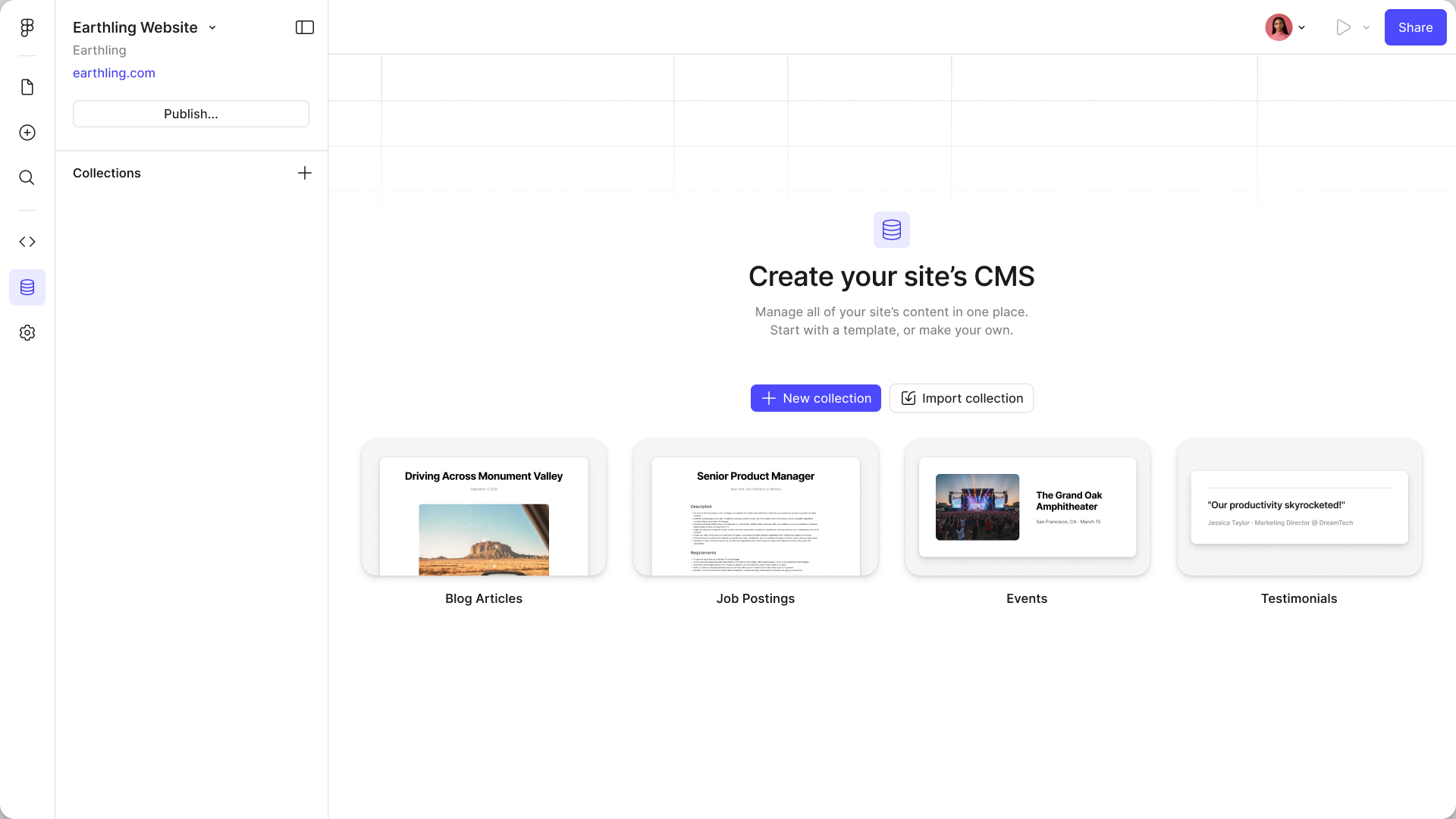
The empty CMS: a “Create your site’s CMS” state offering New collection or Import collection, over four starter templates — Blog Articles, Job Postings, Events and Testimonials
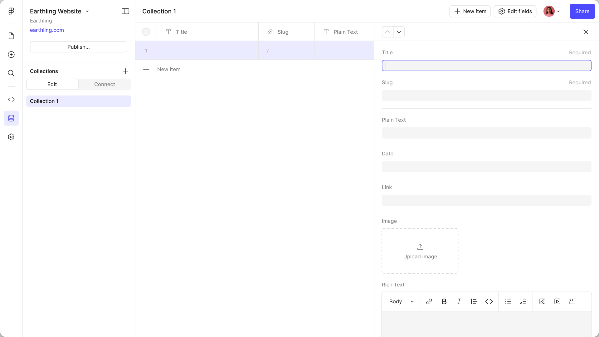
A new collection’s first item open beside the table, with Title, Slug, Plain Text, Date, Link, Image and Rich Text fields waiting to be filled
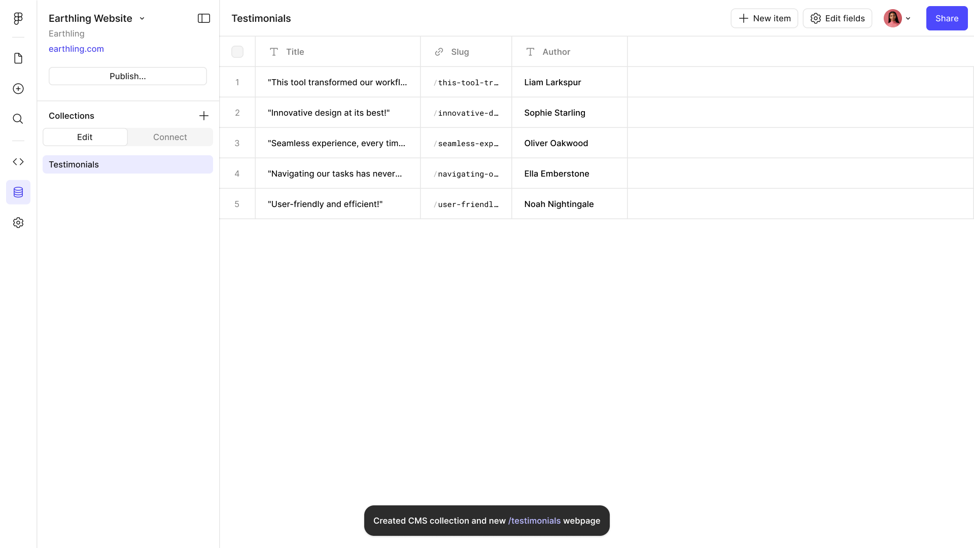
A finished Testimonials collection of five rows, with a toast confirming the collection and a /testimonials page were both created

Schema Editing

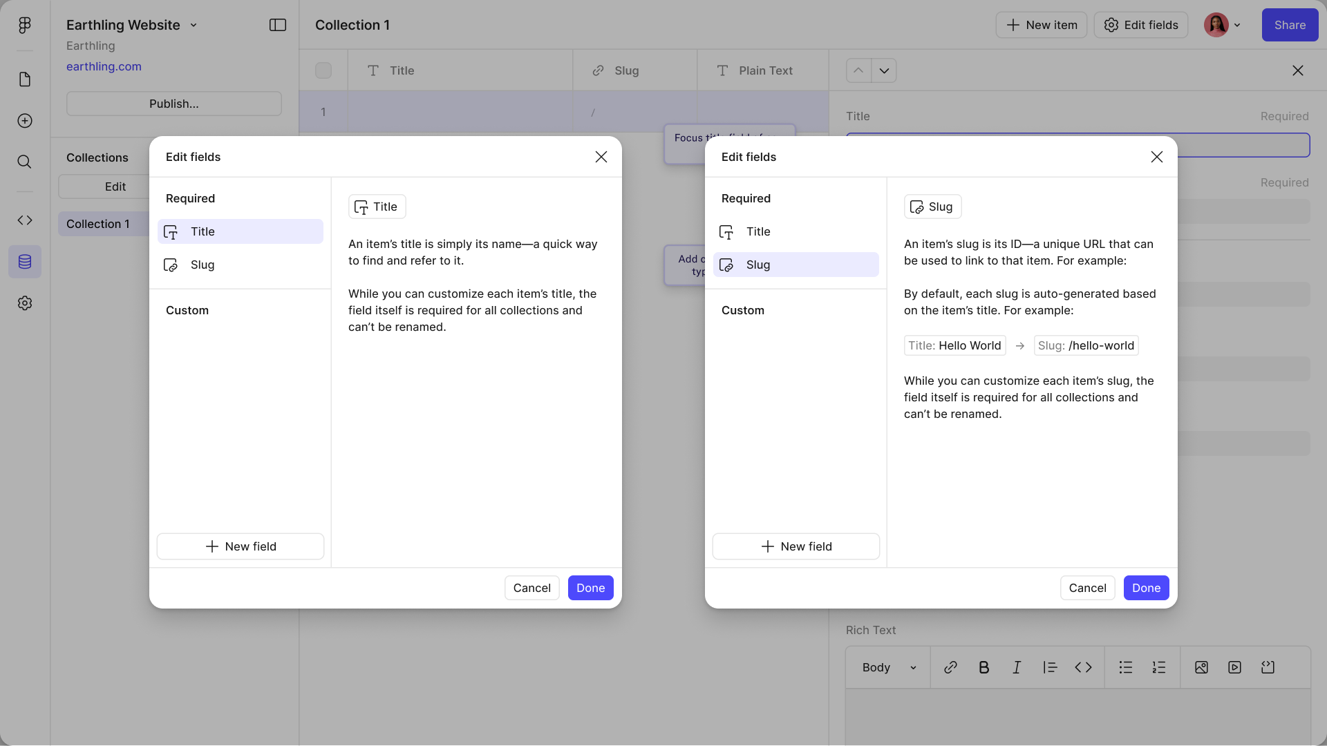
A modal for shaping the collection: rename fields, add new ones, set types. Structural changes stay separate from content editing so they don't happen by accident.
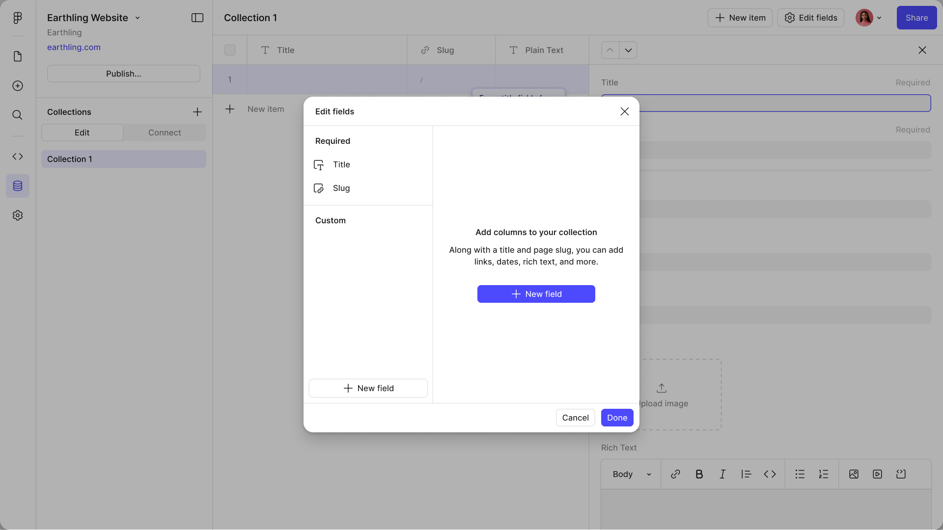
The Edit fields modal on an empty collection, prompting you to add columns alongside the required Title and Slug
Edit fields with Title and Slug selected, each explaining what it does and why it can’t be removed
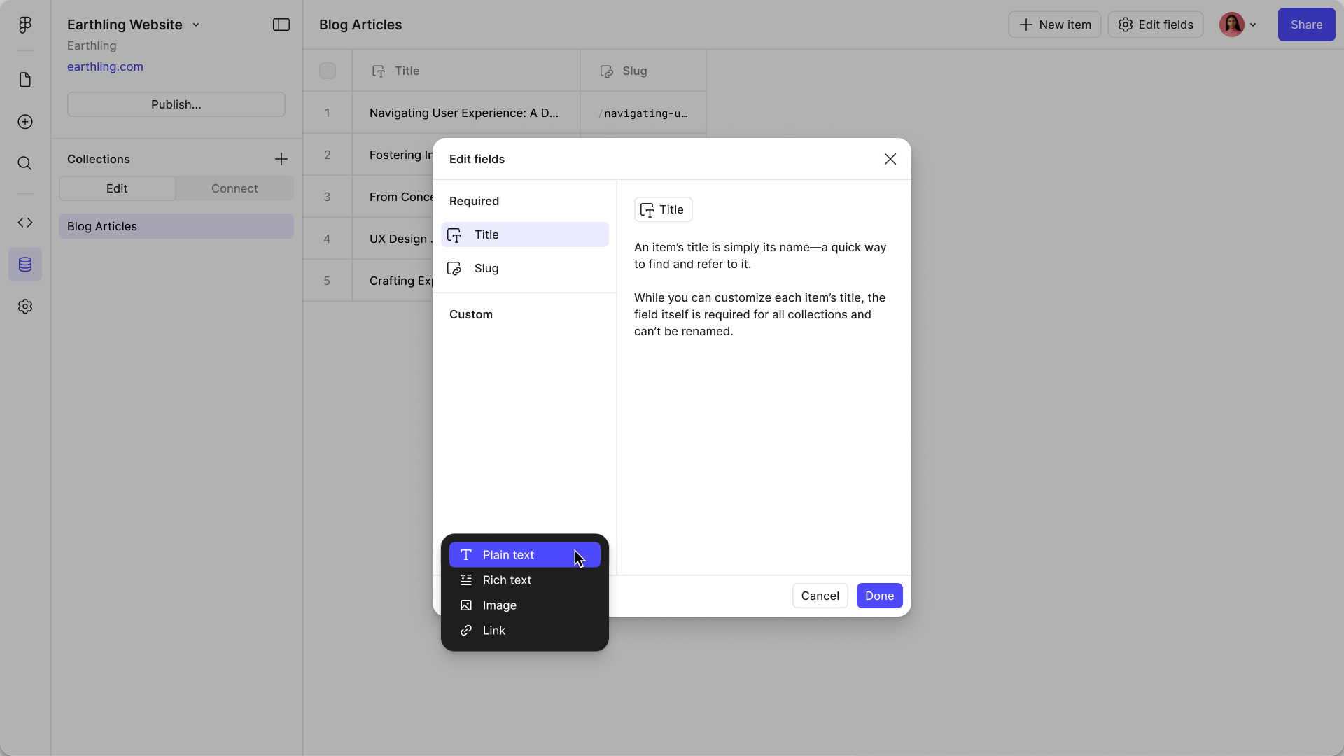
The field-type menu open over a populated collection, offering Plain text, Rich text, Image and Link
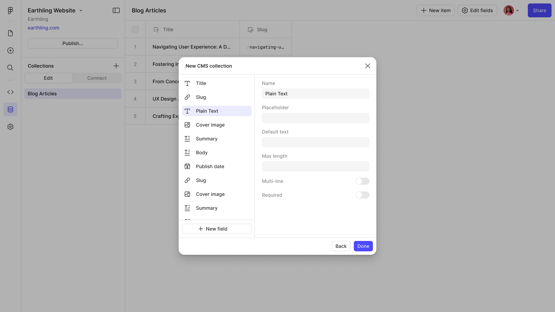
A New CMS collection panel listing its fields — Title, Slug, Cover image, Summary, Body, Publish date — each with a type beside it

Node Connection

Connect mode swaps the canvas from designing to binding. Content appears in place, and you wire up pages, lists, and individual fields to see exactly what publishes.
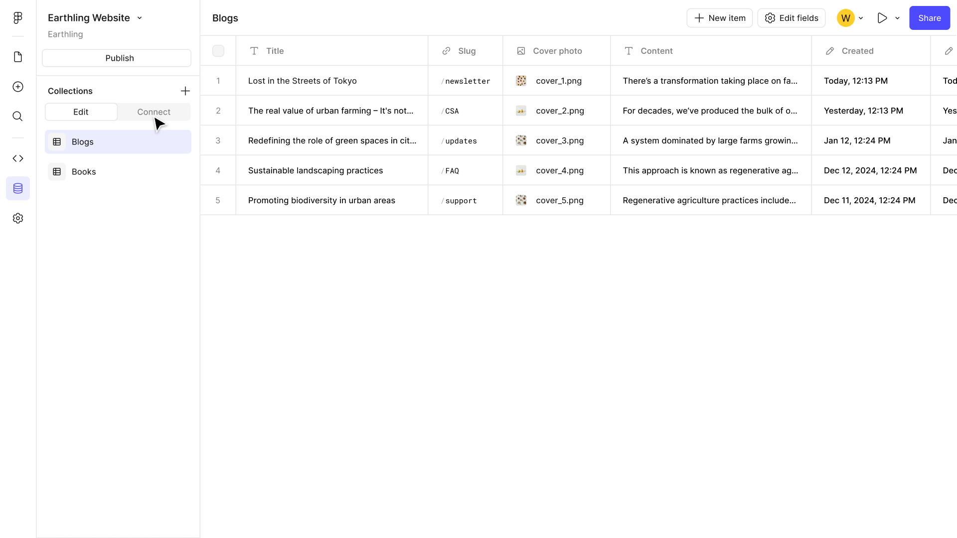
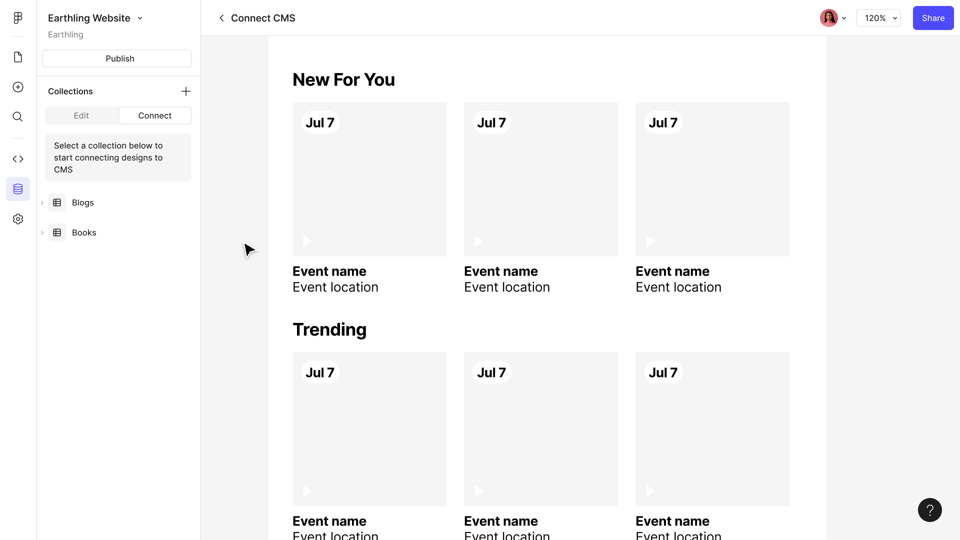
A Blogs collection in the table view, before anything on the canvas is bound to it
Connect mode asking you to pick a collection, with an unbound event grid sitting on the canvas behind it
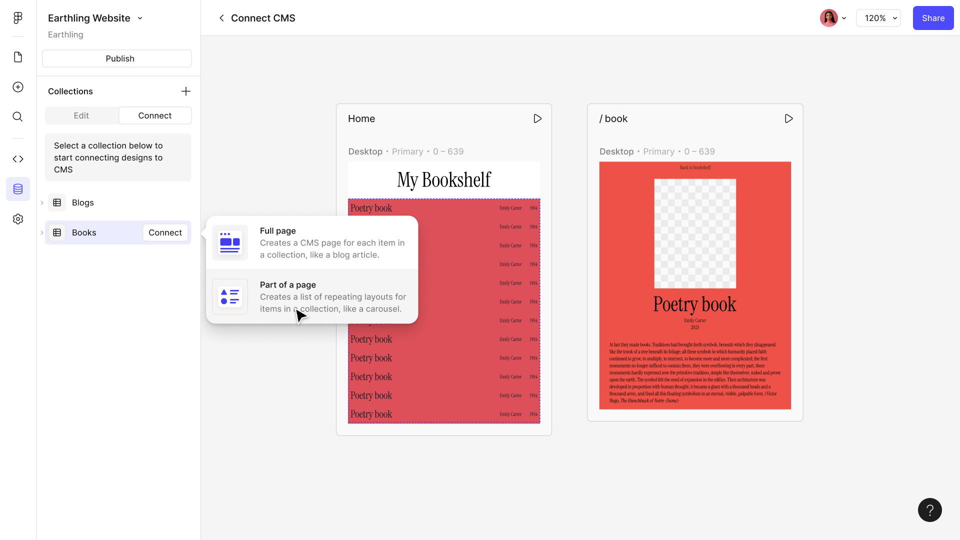
The connect chooser offering “Full page” or “Part of a page” over a row of book-cover designs
A design bound to the collection, the same layout now repeating once per record
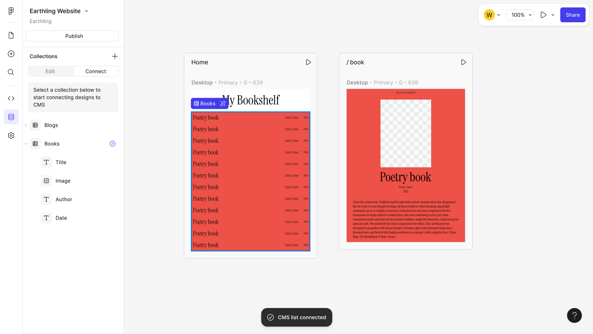
Field-level binding — Title, Image, Author and Date each wired to a node, with a toast confirming the CMS list is connected

Publishing

Push CMS content straight to the web. Flag what's ready, leave the rest in draft, and push only content to the web—no design changes ride along.

Table / Item Views

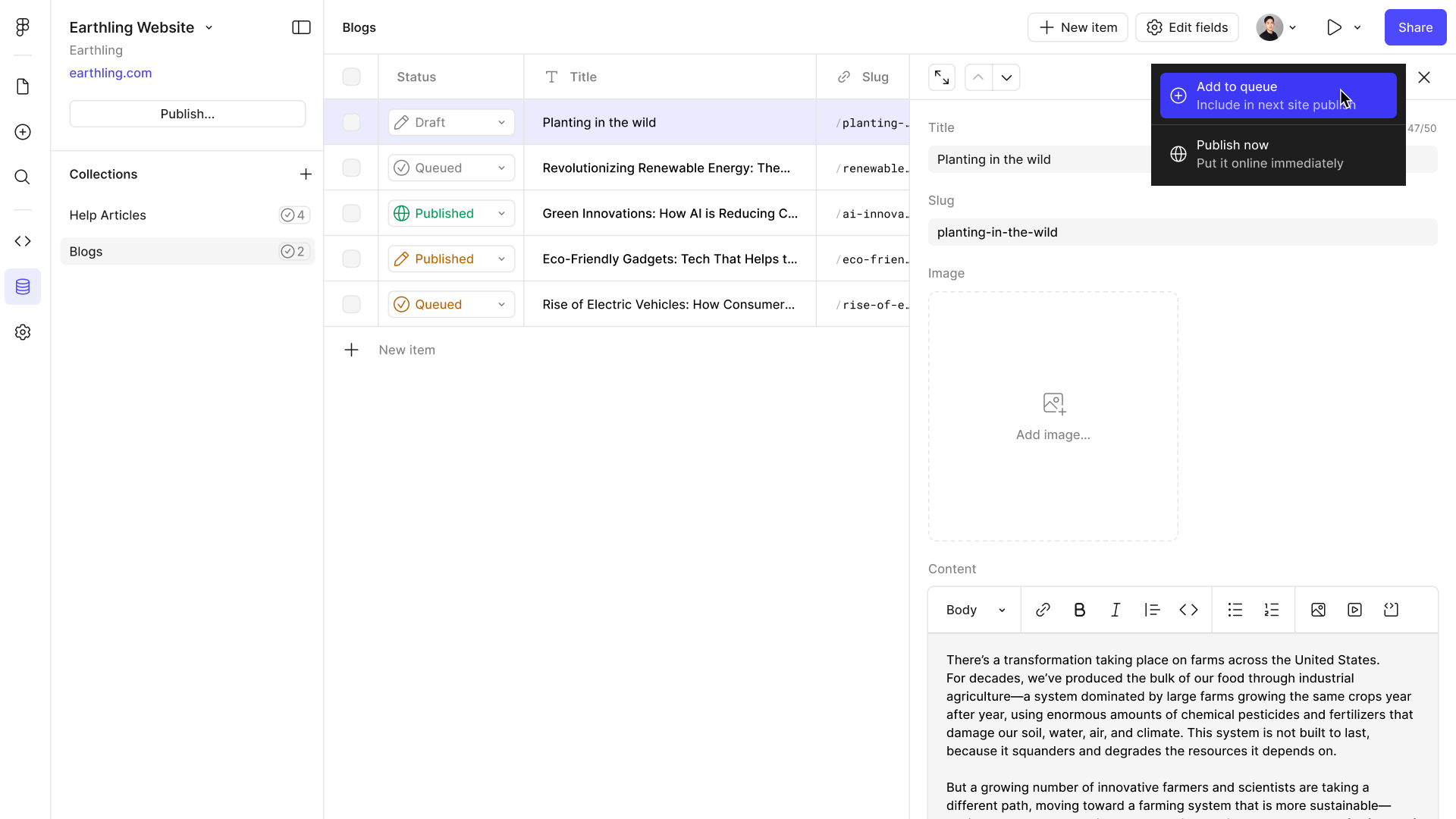
Statuses and publishing actions baked into both the collection table and individual items, along with bulk actions for management at scale.
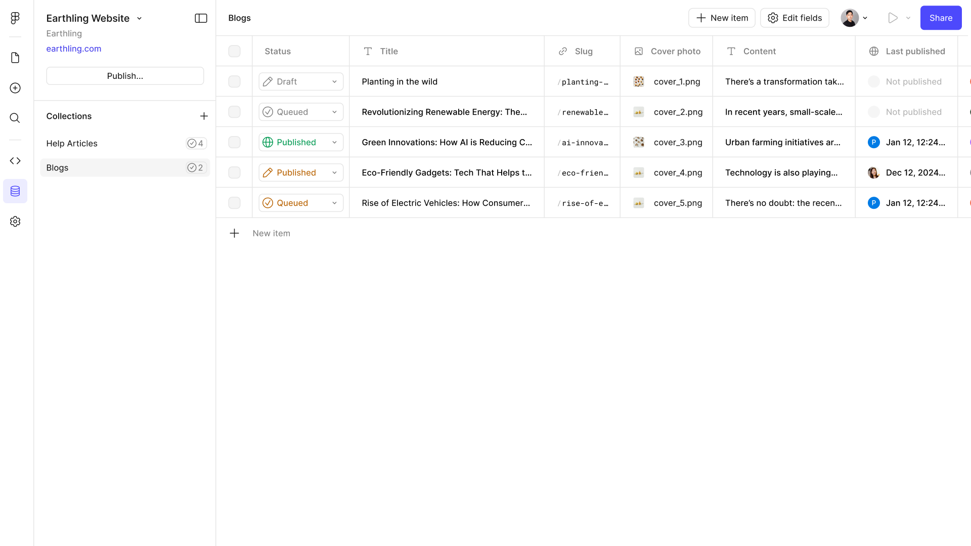
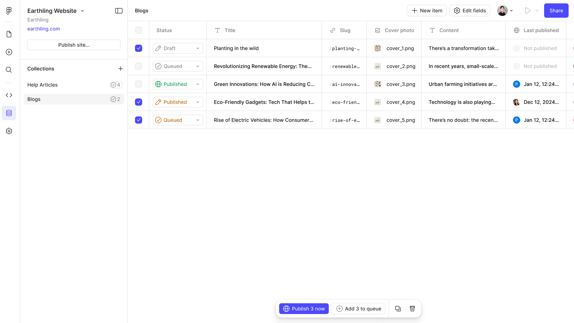
The Blogs collection table, its Status column reading Draft, Queued and Published down the rows, beside Slug, Cover photo, Content and Last published
A single item open beside the table, its publish menu offering “Add to queue — include in next site publish” or “Publish now — put it online immediately”
Three rows multi-selected, with a bulk action bar offering “Publish 3 now” or “Add 3 to queue”

Queueing

Tee up CMS updates to ride along with the next full site publish, so everything—designs and content—goes live at the same time.
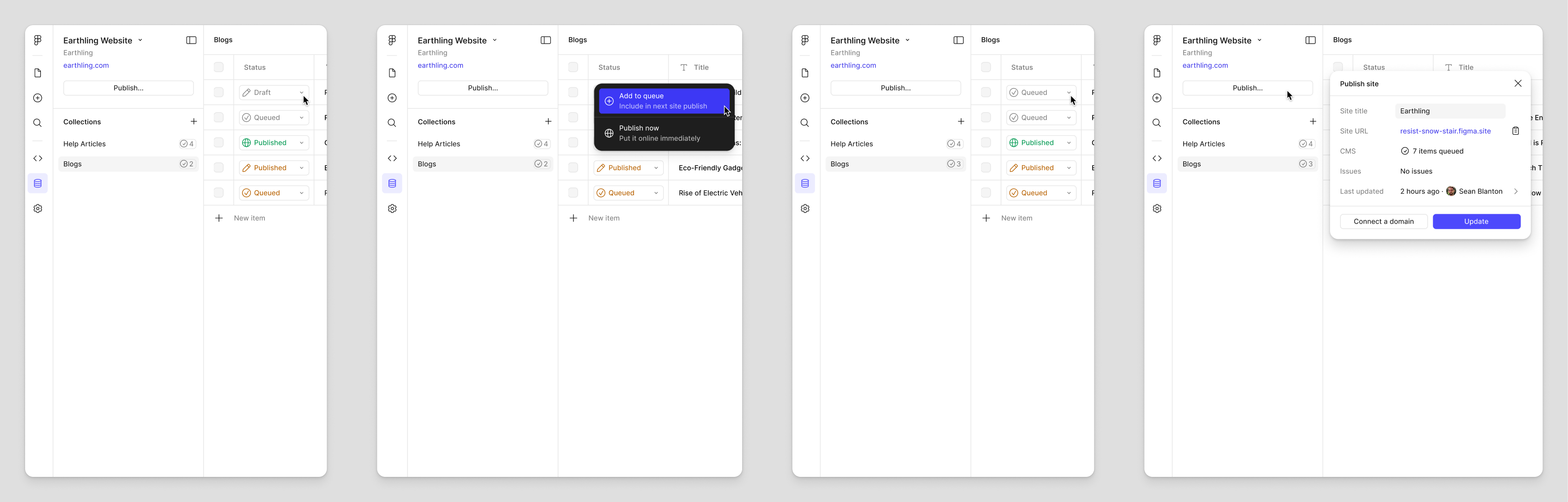
A four-step filmstrip: a draft row, the publish menu with “Add to queue” chosen, the row switching to Queued, then the Publish site panel reporting seven items queued and no issues

Direct Publishing

Push content straight to the web using an existing CMS page—no design input needed.
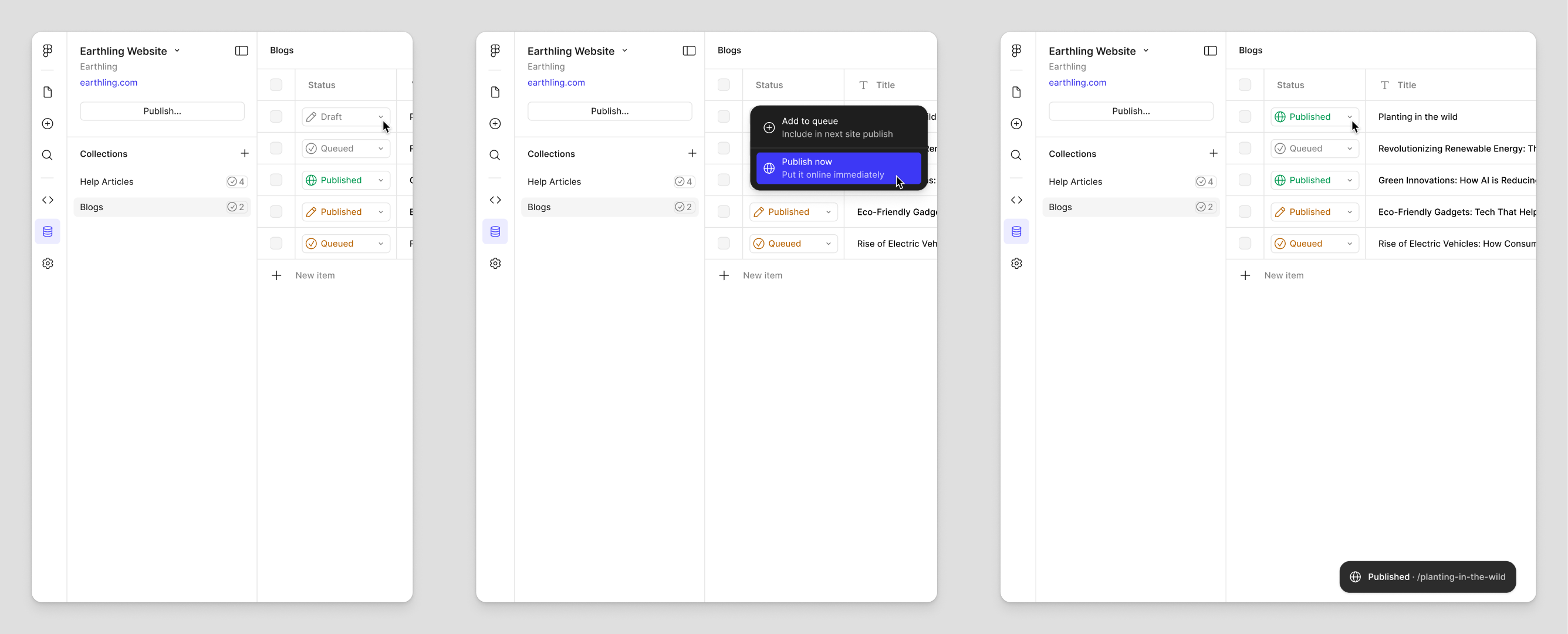
A three-step filmstrip: a draft row, the publish menu with “Publish now” chosen, then the row switching to Published with a toast confirming the live URL

Rich Text

Editing, layout, and the mapping between design styles and text styles. Rich text is where a CMS is most likely to break a design: content varies in length and structure in ways a fixed layout never anticipated. The model here is about giving writers real expressiveness while keeping the output inside what the design can hold.

Editing / Interaction

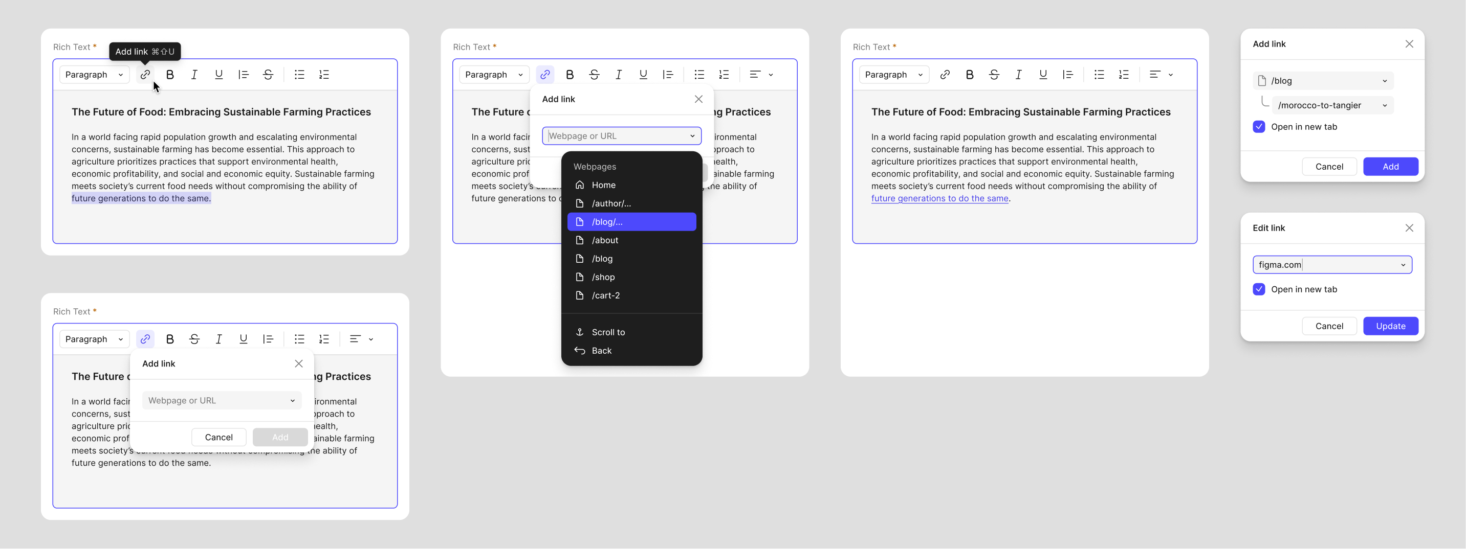
The editor itself: alignment, links to internal pages or external URLs, and a toolbar that adapts as the editing surface narrows.
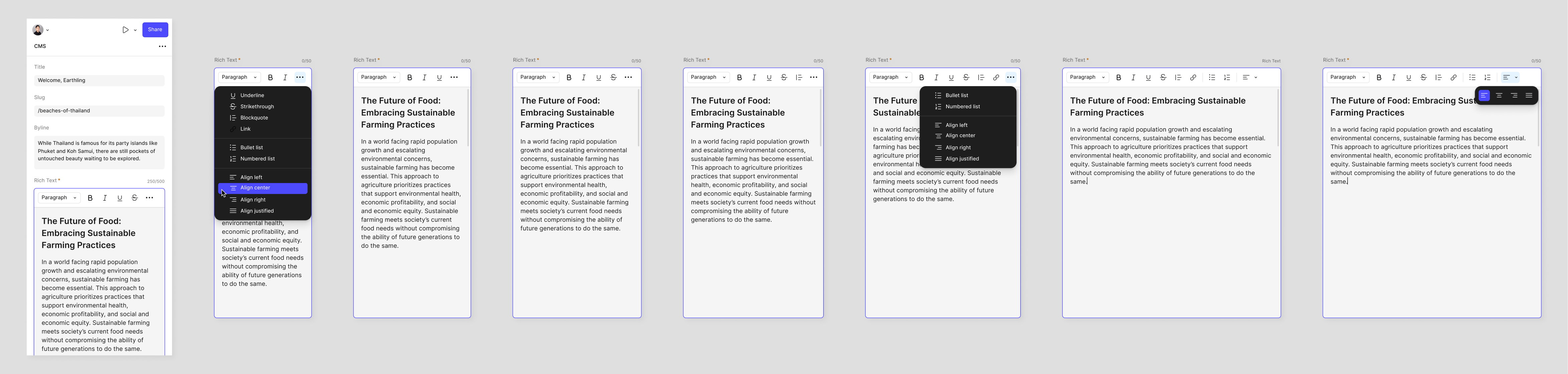
A filmstrip of the rich text editor: the entry beside its block menu — underline, strikethrough, blockquote, link, lists — then the toolbar collapsing step by step as the editing surface narrows, with the alignment submenu open
Adding a link: the Add link popover offering a webpage or URL, its dropdown listing the site’s own pages, and the Edit link state with an external URL and “Open in new tab” checked

Layout & Images

How content flows, and what happens when images enter it—the mental model that keeps a variable-length document inside a fixed design.
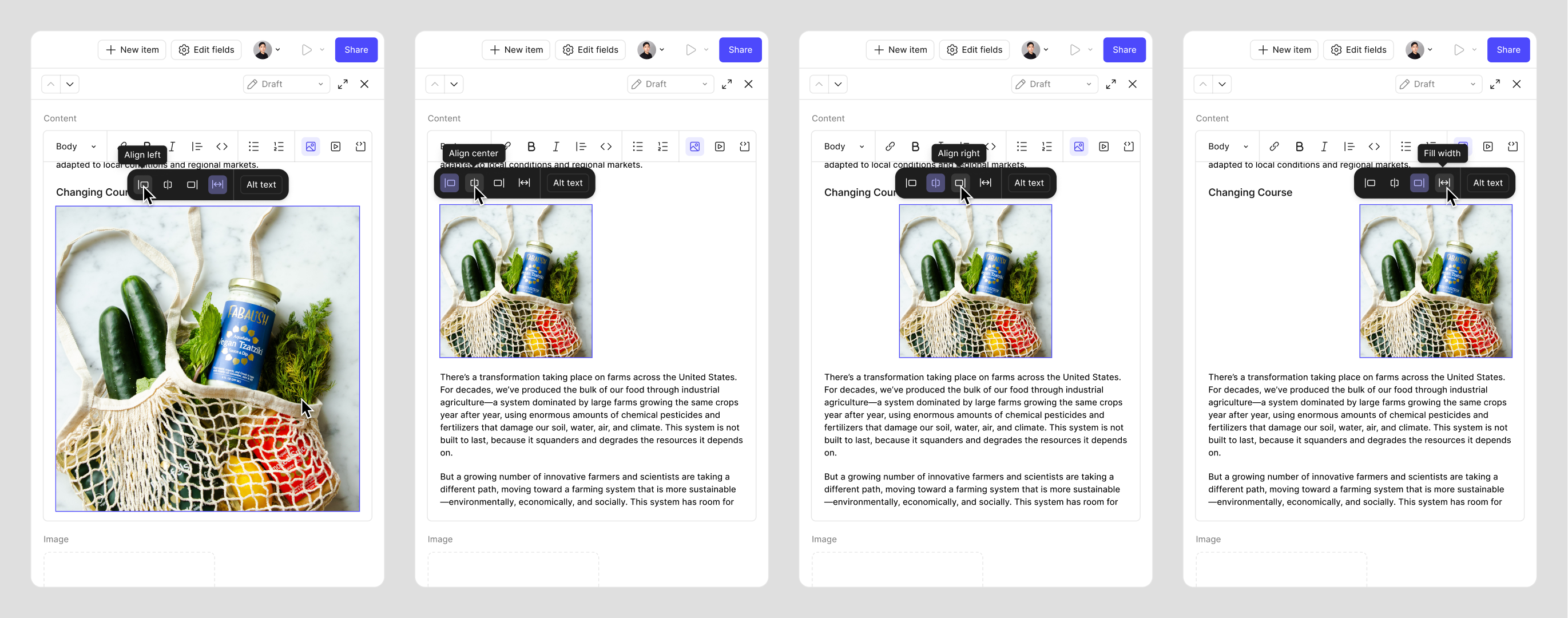
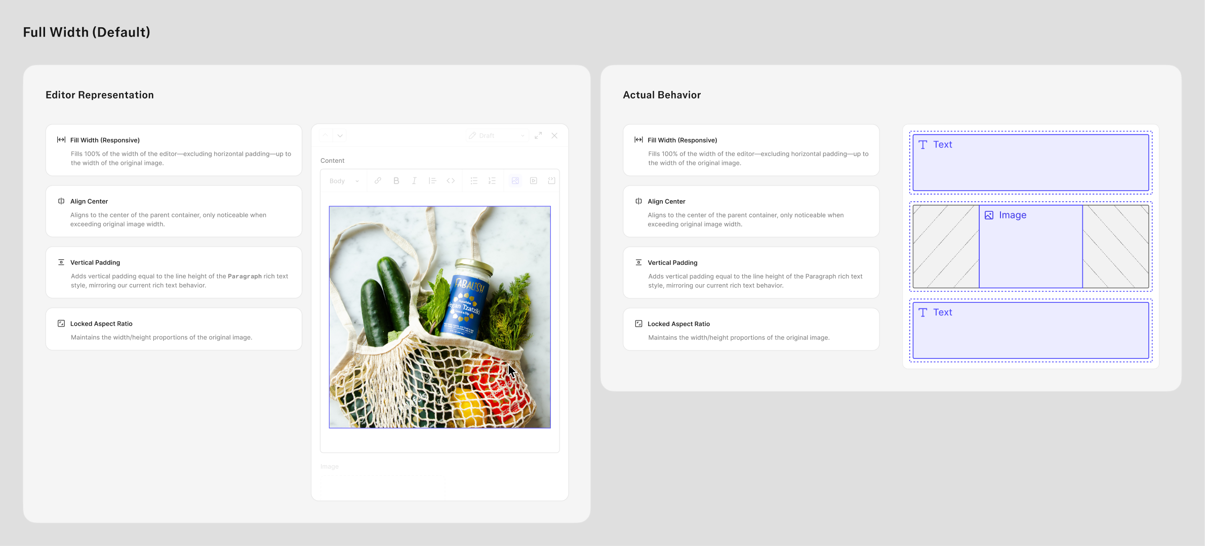
A four-panel strip of an image’s alignment options inside the editor — Align left, Align center, Align right, Fill width — each tooltip open and the body copy reflowing around the image
The Full Width default explained twice over: what the editor shows beside how it actually behaves, with notes on responsive fill, centering, vertical padding and locked aspect ratio
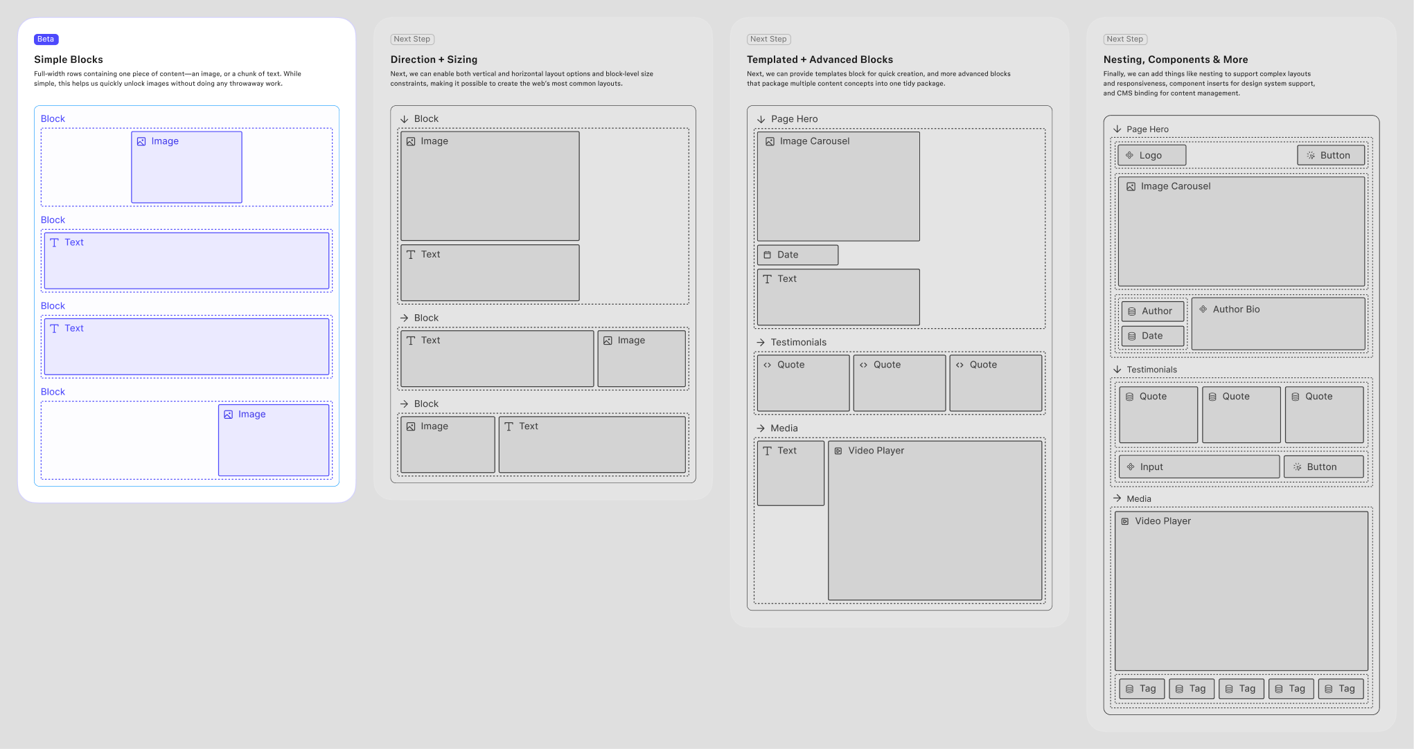
The block roadmap — Simple Blocks shipping in beta as full-width rows of one image or one chunk of text, then Direction + Sizing, Templated + Advanced Blocks, and Nesting, Components & More as the steps after

Style Mapping

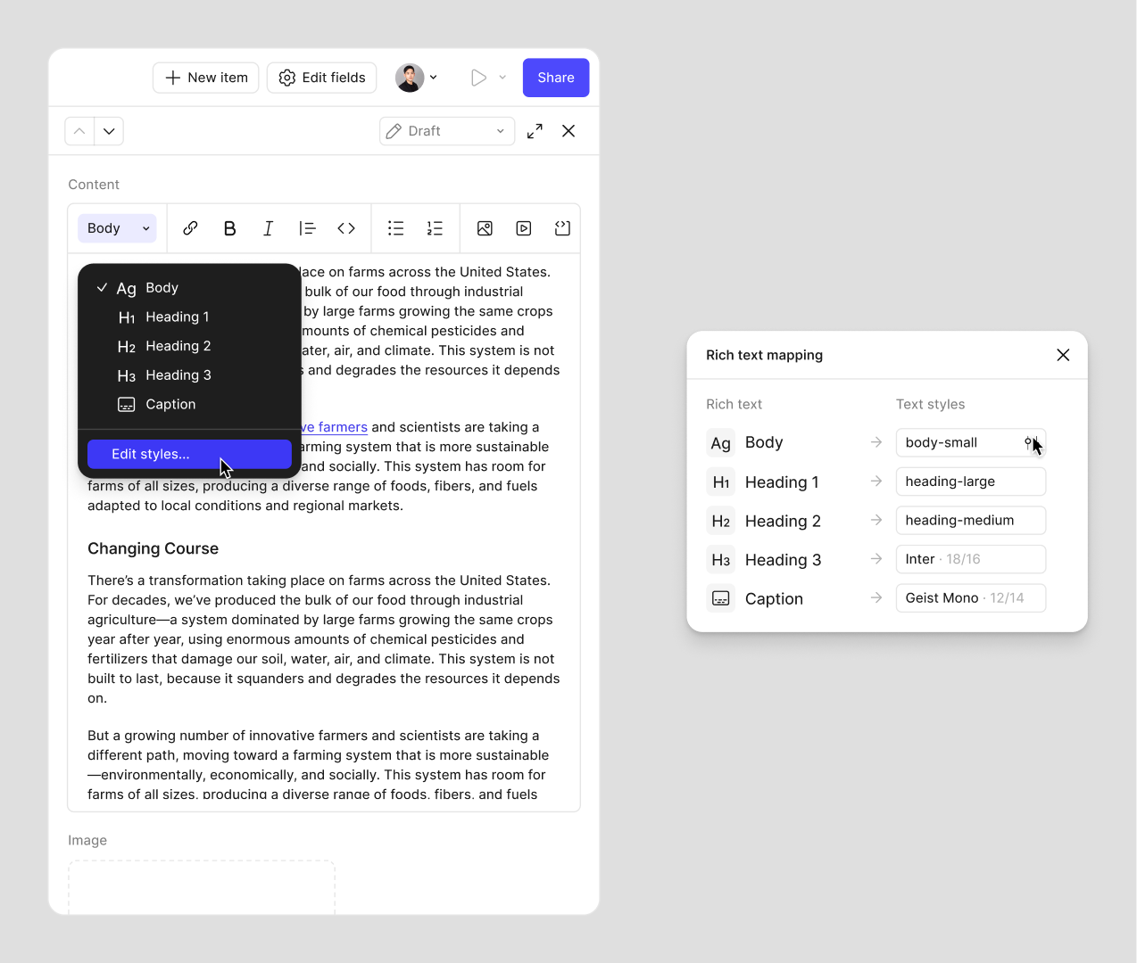
Designers map design styles to rich text styles once. Writers then see a short list of named options rather than a full formatting toolbar, so nothing they choose can fall outside the design. Keeps writers from needing to think about the designs—only the intent / purpose of the text.
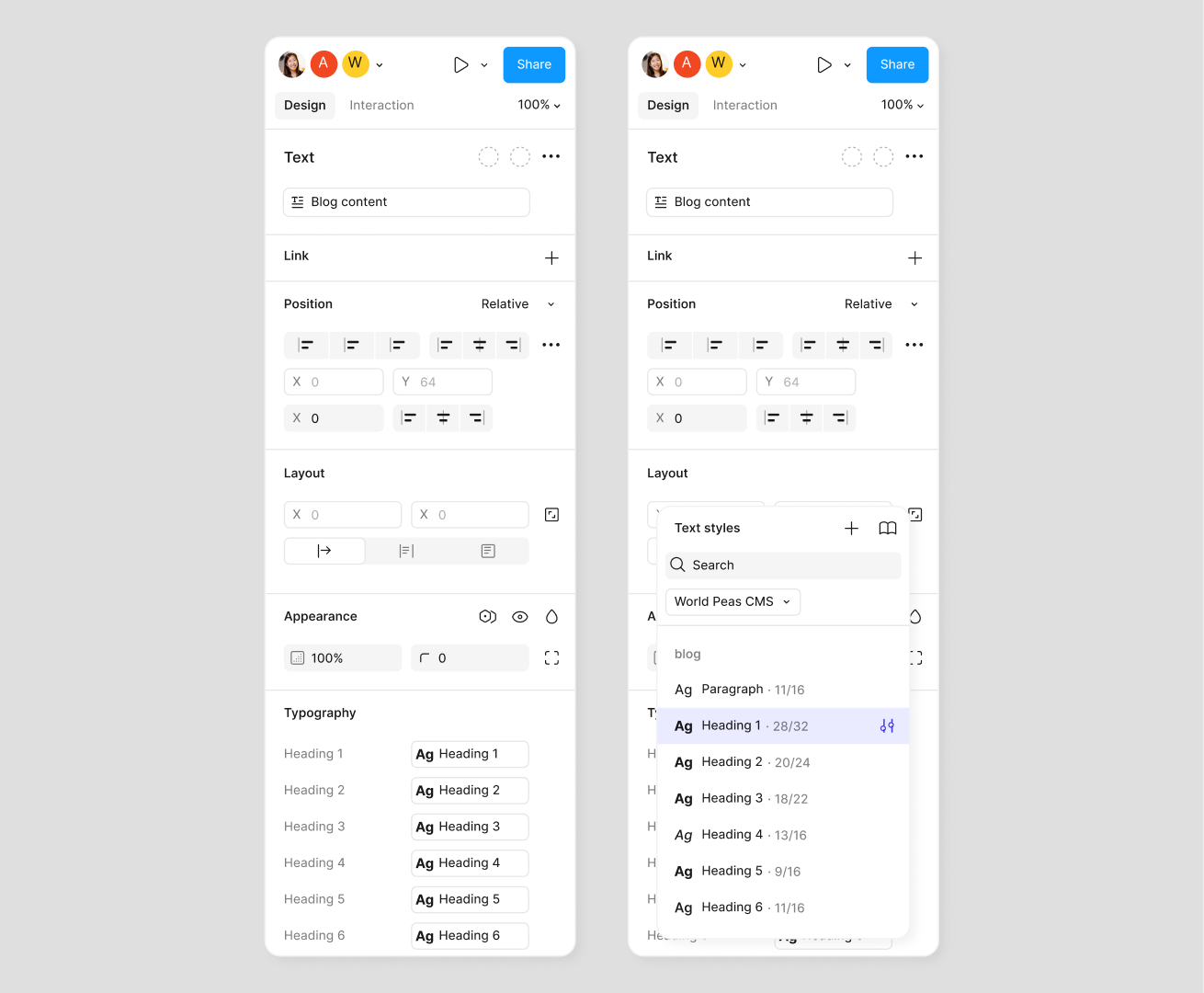
Two properties panels side by side: the Typography section mapping Heading 1 through 6 onto design styles, and the text-style picker open on the site’s own CMS styles with their sizes and line heights
The writer’s half of the same system: the editor’s style menu offering Body, Heading 1–3 and Caption, beside the Rich text mapping panel wiring each of those to a named design style

AI Collections

Generation, scoped to unblocking design before real content exists. The bet was narrow on purpose—not generating finished sites, just enough structure to design against. Designers routinely wait on content that isn't written yet, and that wait is a real cost.

Generation

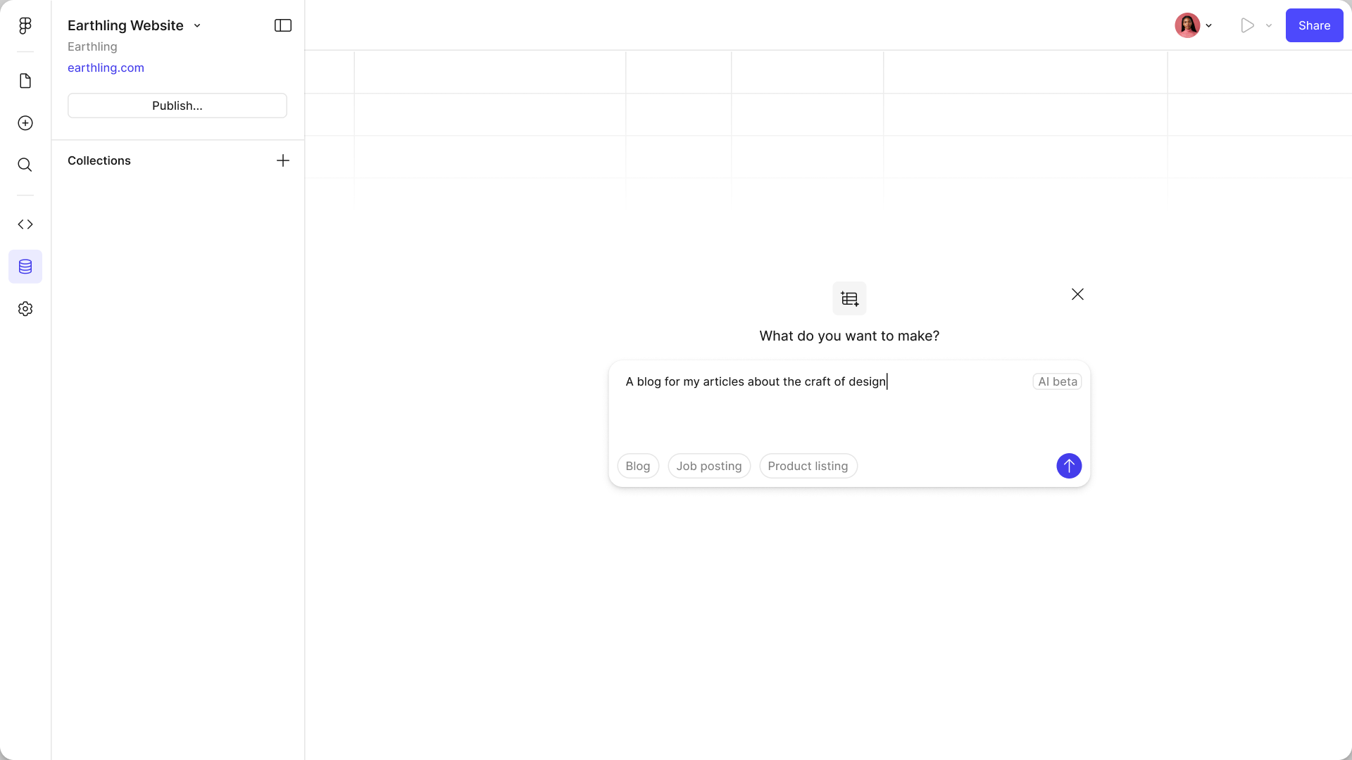
Describe the content you need and get a structured collection with sample items. Designers stop waiting on content to start designing, and the structure is real enough to build against.
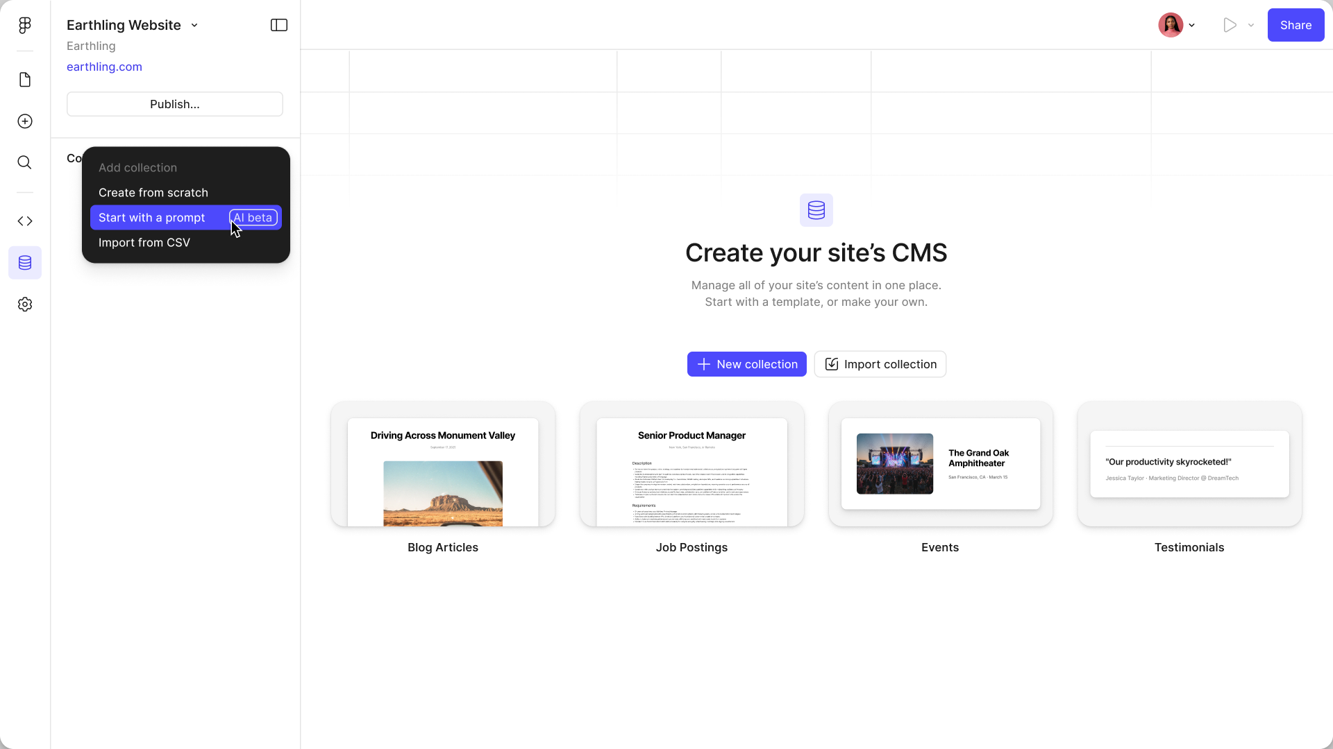
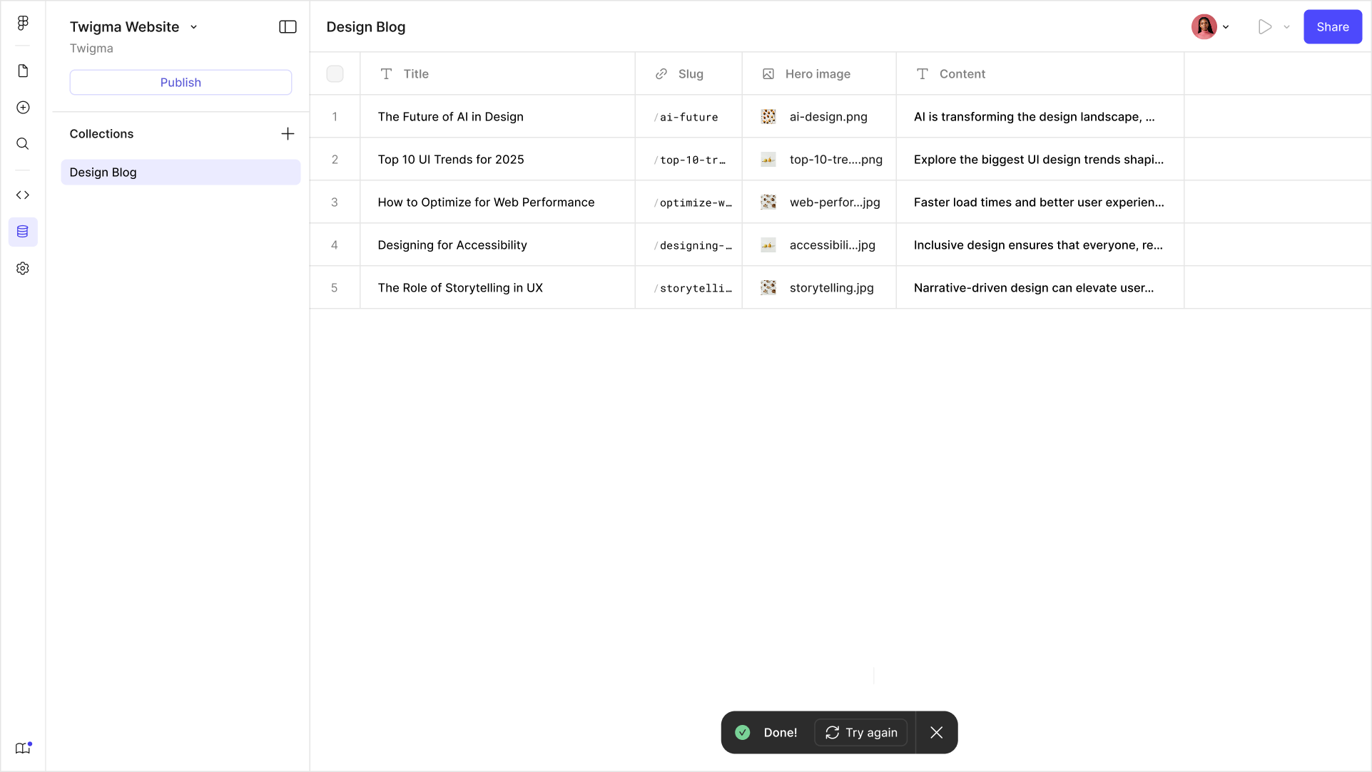
The empty CMS with the add-collection menu open: create from scratch, start with a prompt, or import from CSV
The prompt sheet — “What do you want to make?” — with a request for a blog about the craft of design typed in, and Blog, Job posting and Product listing as quick starts
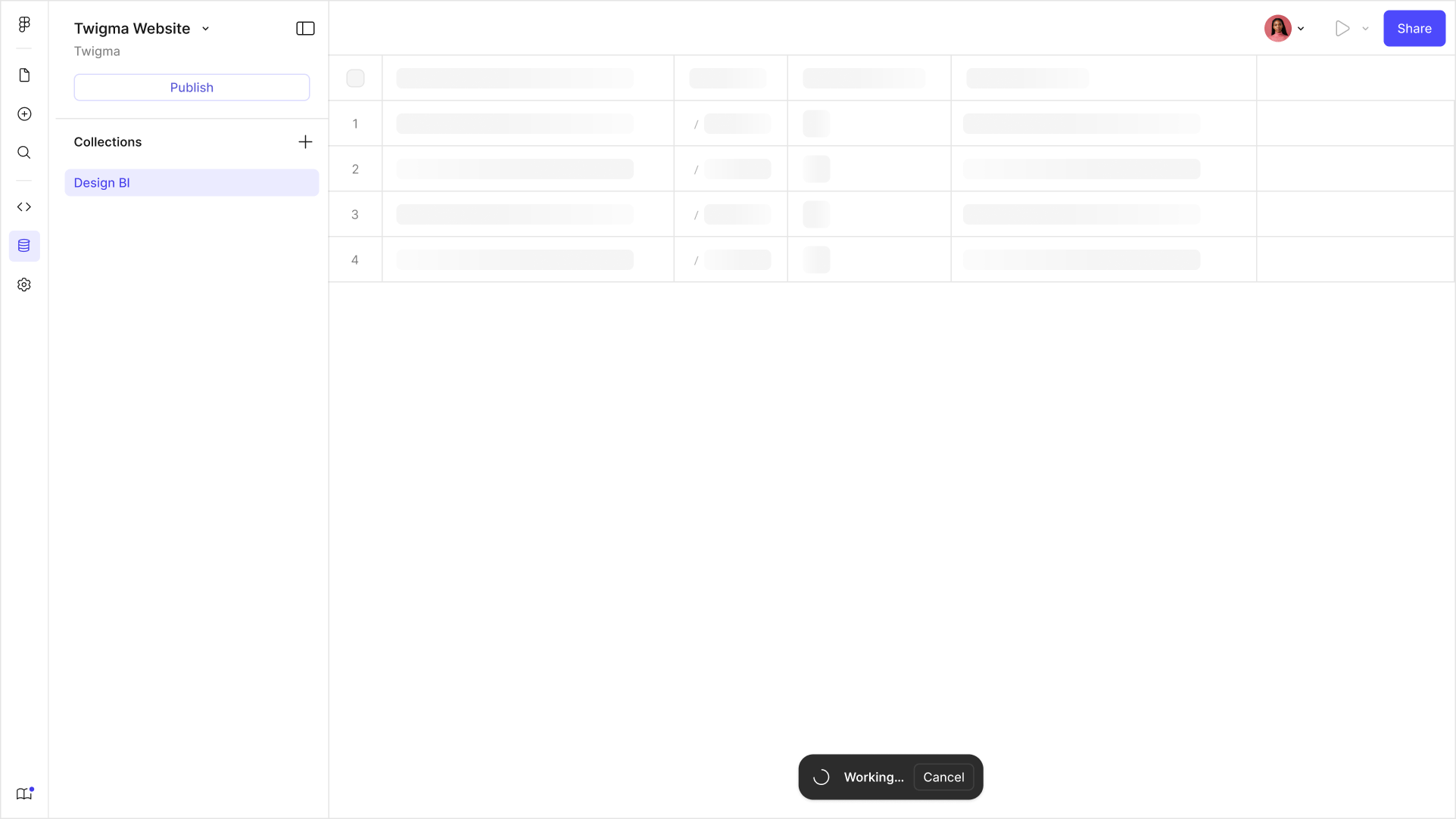
Generation in progress: skeleton rows filling the table with a Working indicator and a cancel affordance
The generated Design Blog collection, six rows deep, each with a title, slug, hero image and summary ready to edit

Templates

Preconfigured collections and page designs, wired together. The hardest thing to convey about a CMS is the connection between design and content, and an empty state can't demonstrate it. Templates teach the model by handing you a working example to take apart.

New Collection

Picking a template inserts both the collection and a set of basic page designs, already connected. The first thing you see is a working CMS rather than an empty one.
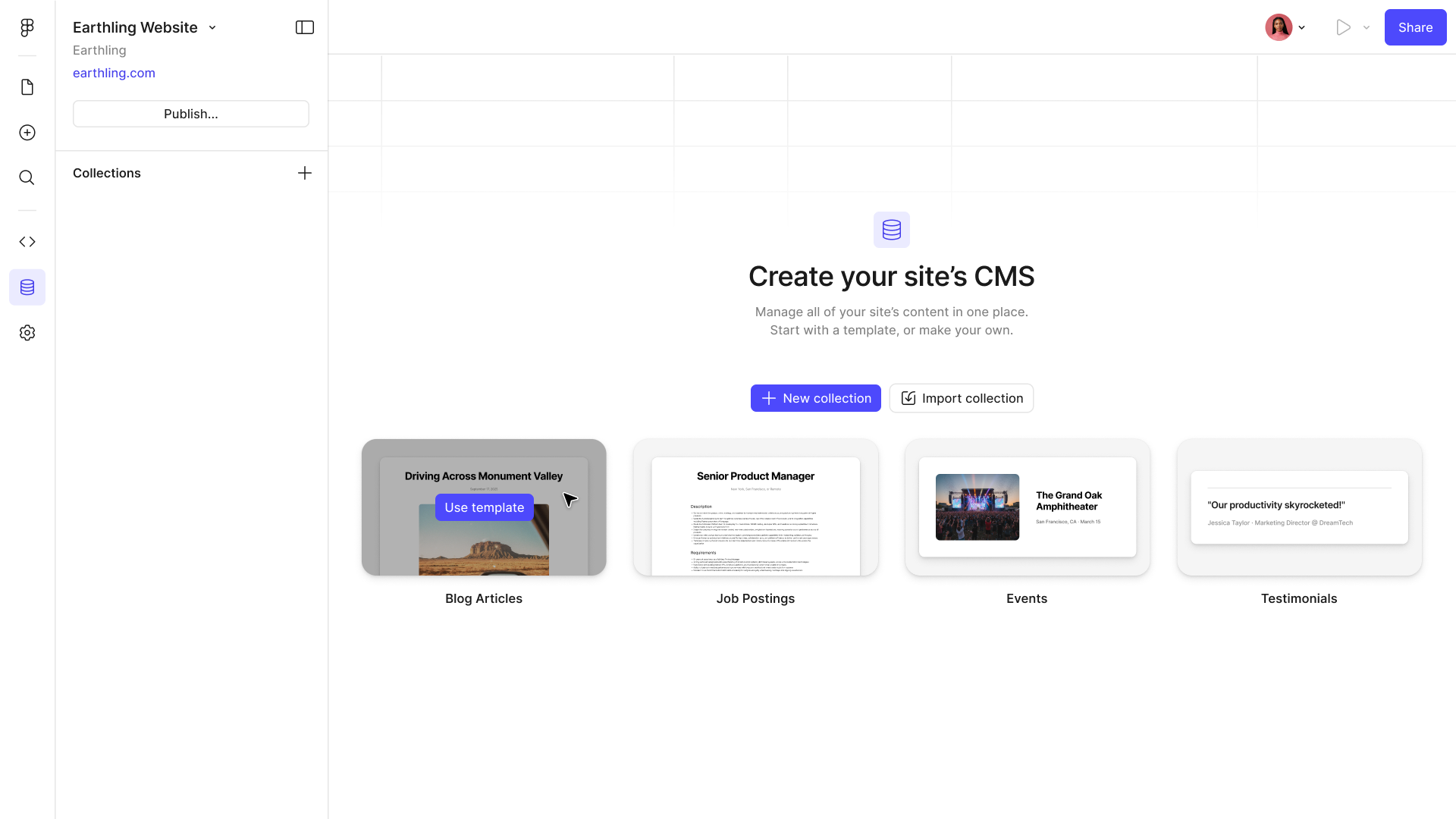
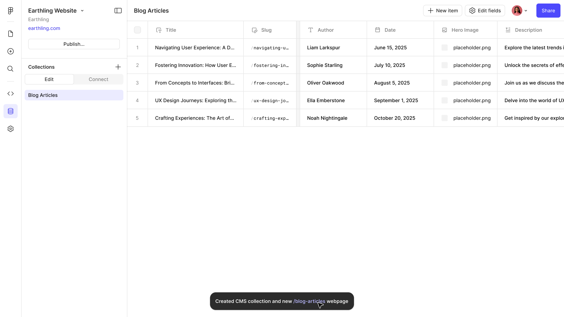
Picking the Blog Articles template from the CMS empty state
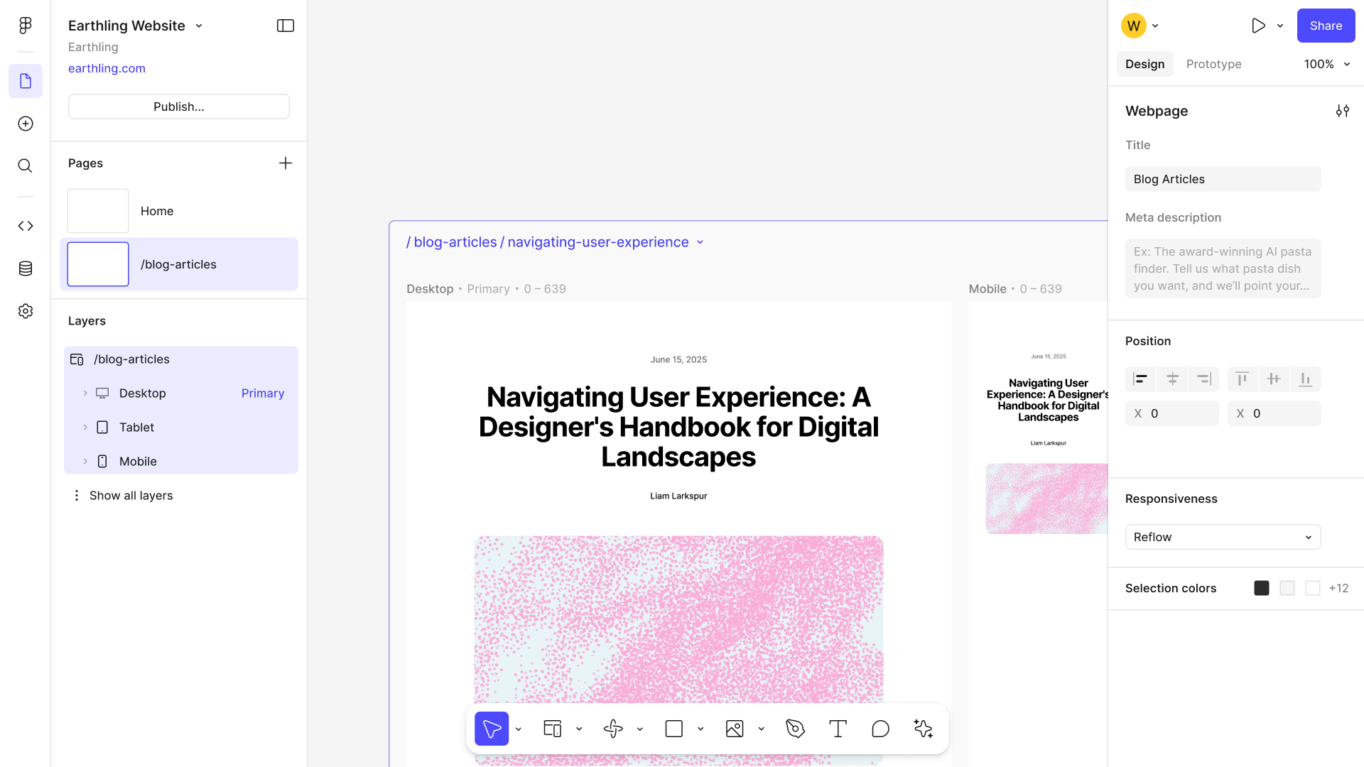
The template’s collection, already populated with sample articles, and a toast confirming a /blog page was created alongside it
The page design that came with the template, open on the canvas with its layer tree — a working article page rather than a blank one

Content & Connection

A look at the template designs and the wiring behind them—which node maps to which field, and how a single page stands in for the whole collection.
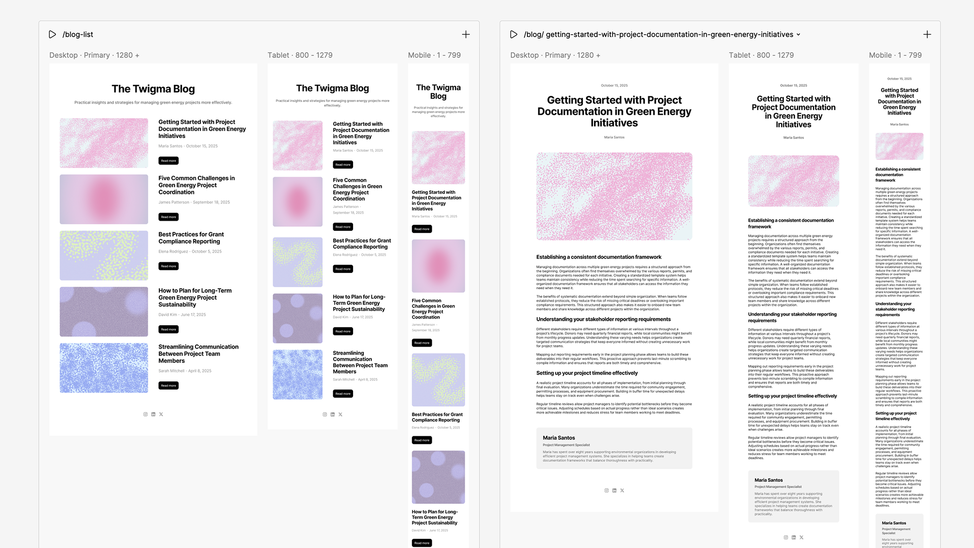
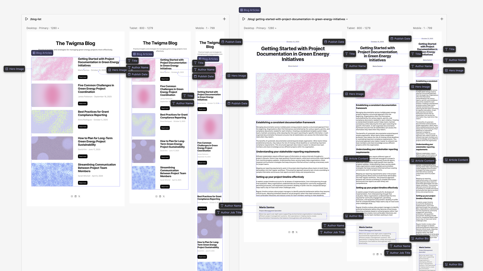
The template’s page designs annotated to show which node takes which field
The same designs with the wiring called out end to end, showing how one page stands in for the whole collection

Last updated